5Marginal Distributions of Continuous Random Variables
Random variables measure numerical quantities of interest associated with a random phenomenon. Random variables can potentially take many different values, usually with some values or intervals of values more probable than others. Even when outcomes of a random phenomenon are equally likely, values of related random variables are usually not. The (probability) distribution of a collection of random variables identifies the possible values that the random variables can take and a way of determining their relative likelihoods. We will see several ways to describe distributions, some of which depend on the number and types (discrete or continuous) of the random variables under investigation.
Commonly encountered random variables can be classified as discrete or continuous (or a mixture of the two1).
A discrete random variable can take on only countably many isolated points on a number line. These are often counting type variables. Note that “countably many” includes the case of countably infinite, such as \(\{0, 1, 2, \ldots\}\).
A continuous random variable can take any value within some uncountable interval, such as \([0, 1]\), \([0,\infty)\), or \((-\infty, \infty)\). These are often measurement type variables.
We will see a few ways of specifying a distribution, including
A well labeled plot
A table of possible values and corresponding probabilities for discrete random variables. This could be a two-way table for the joint distribution of two discrete random variables (or multi-way table)
A probability mass function for discrete random variables which maps possible values \(x\) — or \((x, y)\) pairs, etc — to their respective probability.
A probability density function for continuous random variables which maps possible values \(x\) — or \((x, y)\) pairs, etc — to their respective probability “density”.
A cumulative distribution function, which provides all the percentiles (a.k.a. quantiles) of the distribution
By name, including values of relevant parameters, e.g., “Uniform(0, 60)”, “Normal(30, 10)”, “Poisson(1)”, “BivariateNormal(30, 30, 10, 10, 0.7)”. We will see that some probabilistic situations are so common that the corresponding distributions have special names. Each named distribution has corresponding parameters, e.g., 0 and 60 are the parameters of the Uniform(0, 60) distribution. Always be sure to specify values of relevant parameters, e.g., “Normal(30, 10) distribution” rather than just “Normal distribution”. Be careful: different named distributions have different identifying parameters. For example, the parameters 0 and 60 mean something different for the Uniform(0, 60) distribution than for the Normal(0, 60) distribution.
Distributions of random variables can be thought of as collections of probabilities of events involving the random variables. As for probabilities, we can interpret probability distributions of random variables as:
long run relative frequency distributions: what pattern of values would emerge if we repeated the random process many times and observed many values of the random variables?
subjective probability distributions: which potential values of these uncertain numerical quantities are relatively more plausible than others?
Regardless of the interpretation, we can use simulation to investigate distributions of random variables: simulate many values of the random variables and summarize them in various ways to describe the pattern of variability. We will often represent distributions as spinners (or a collection of spinners) which when spun many times achieve the appropriate long run pattern of values of the random variables.
Most interesting problems involve two or more random variables defined on the same probability space. In these situations, we can consider how the variables vary together and study relationships between them. A joint distribution describes the full pattern of variability of a collection of random variables. In the context of multiple random variables, the distribution of any one of the random variables alone is called a marginal distribution.
The continuous analog of a probability mass function (pmf) is a probability density function (pdf). However, while pmfs and pdfs play analogous roles, they are different in one fundamental way; namely, a pmf outputs probabilities directly, while a pdf does not.
5.1 Histograms and densities
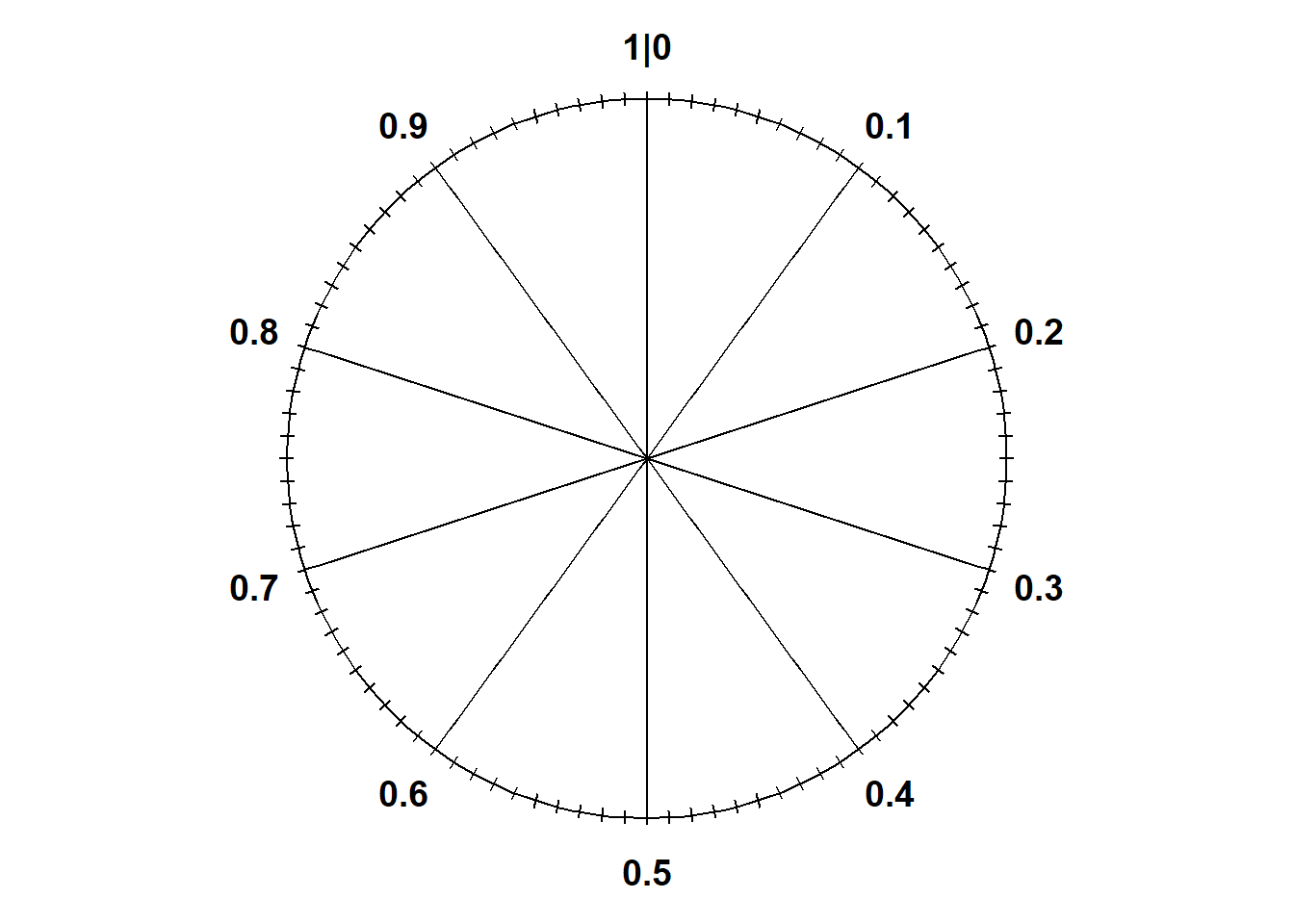
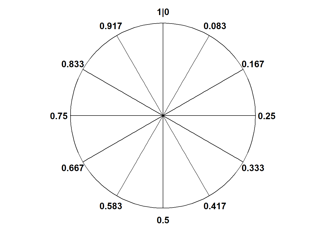
We’ll start with the simplest continuous situation. Uniform probability measures are the continuous analog of equally likely outcomes. The standard uniform model is the Uniform(0, 1) distribution corresponding to the spinner in Figure 5.1 which returns values between2 0 and 1. Only select rounded values are displayed, but the spinner represents an idealized model where the spinner is infinitely precise so that any real number between 0 and 1 is a possible value. We assume that the (infinitely fine) needle is “equally likely” to land on any value between 0 and 1.
(a) Each sector is 10% of the total area
(b) Each sector is 1/12 of the total area
Figure 5.1: A continuous Uniform(0, 1) spinner. It’s the same spinner on both sides just with different values displayed. Only selected rounded values are displayed, but in the idealized model the spinner is infinitely precise so that any real number between 0 and 1 is a possible value.
Let \(U\) be the random variable representing the result of a single spin of the Uniform(0, 1) spinner. The following Symbulate code defines this RV and simulates 100 values of it.
U = RV(Uniform(0, 1))u = U.sim(100)u
Index
Result
0
0.1949265098612648
1
0.03938638211179357
2
0.6517311578663043
3
0.7282630435912029
4
0.9885422123139256
5
0.793423455329716
6
0.12538848055439689
7
0.8023563746552934
8
0.4627717152996621
...
...
99
0.11399824166480998
Notice the number of decimal places3. Remember that for a continuous random variable, any value in some uncountable interval is possible. For the Uniform(0, 1), any value in the continuous interval between 0 and 1 is a distinct possible value: 0.20000000000… is different from 0.20000000001… is different from 0.2000000000000000000001… and so on.
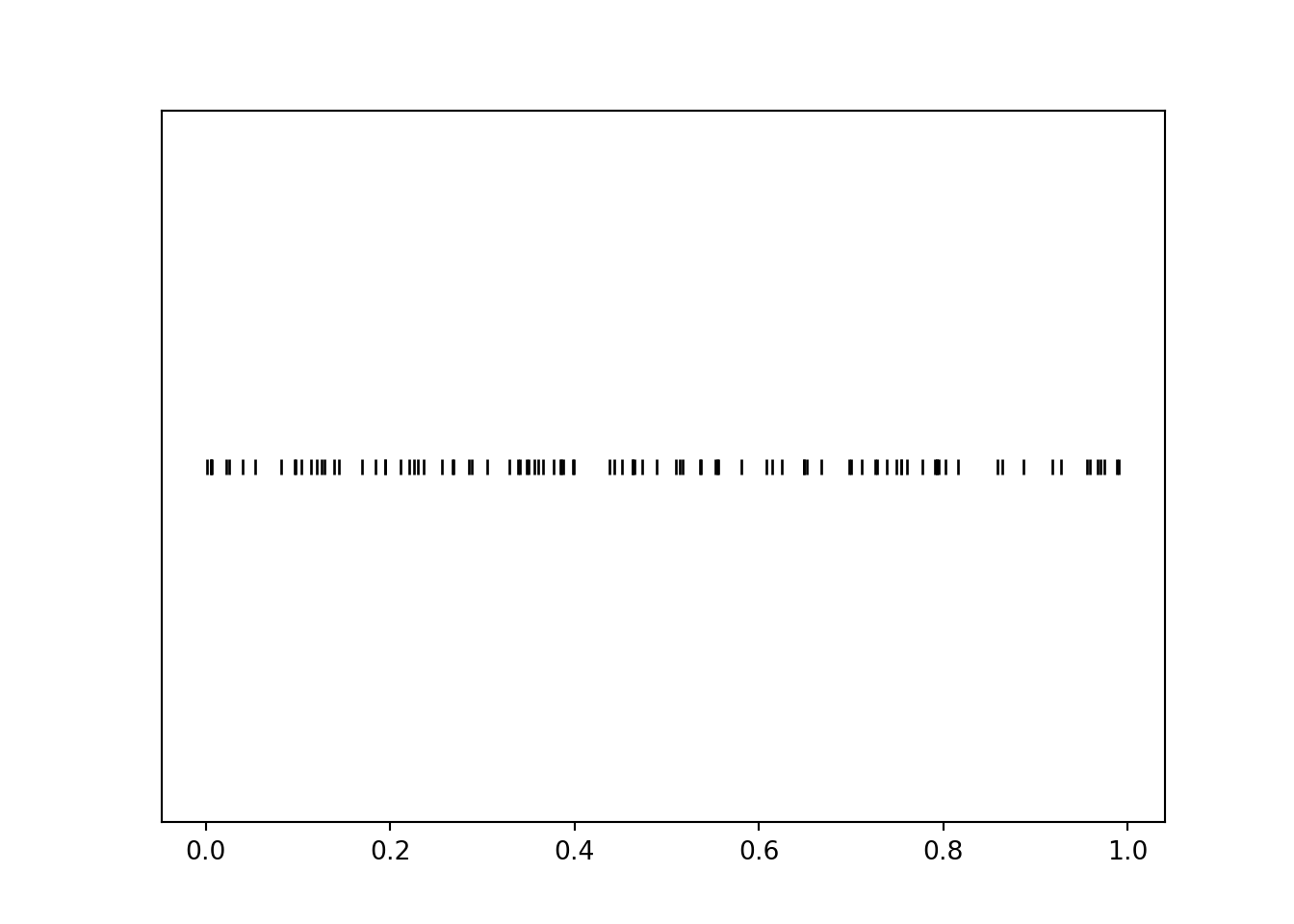
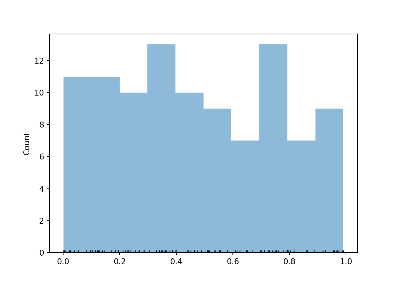
The rug plot displays 100 simulated values of \(U\). Note that the values seem to be “evenly spread” between 0 and 1, though there is some natural simulation variability.
plt.figure()u.plot('rug')plt.show()
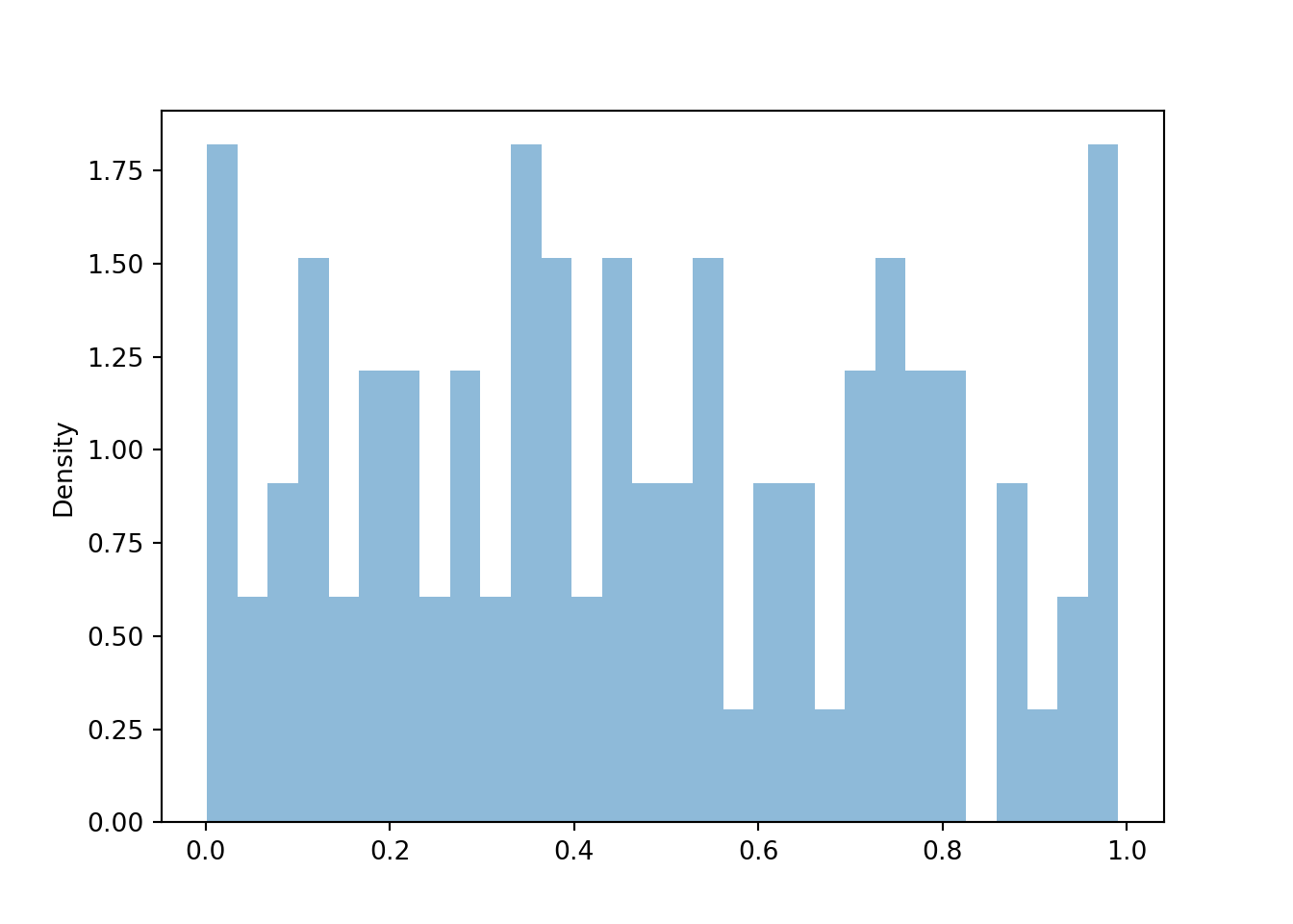
For continuous random variables, finding frequencies of individual values and impulse plots don’t make any sense since each simulated value will only occur once in the simulation. (Again, note the number of decimal places; if the first simulated value is 0.040815162342, we’re not going to see that exact value again.) Instead, we summarize simulated values of continuous random variables in a histogram (the Symbulate default plot for summarizing values on a continuous scale). A histogram groups the observed values into “bins” and plots frequencies or densities for each bin4. In a histogram, one axis is a number line representing values of the variable; the other axis is frequency or density. We’ll discuss “density” in more detail soon.
plt.figure()u.plot()plt.show()
Below we add a rug plot to the histogram to see the individual values that into each bin (we also change the number of bins). We also add the argument normalize = False to display bin frequencies, that is, counts of the simulated values falling in each bin, on the vertical axis.
Typically, in a histogram areas of bars represent relative frequencies; in which case the axis which represents the height of the bars is called “density”. It is common practice that the bins all have the same width5 so that the ratio of the heights of two different bars is equal to the ratio of their areas. That is, with equal bin widths, bars with the same height represent the same area/relative frequency; though the area of the bar rather than the height is the actual relative frequency. While the bins in a histogram typically have the same width, we will also use histograms with unequal bin widths to illustrate some ideas.
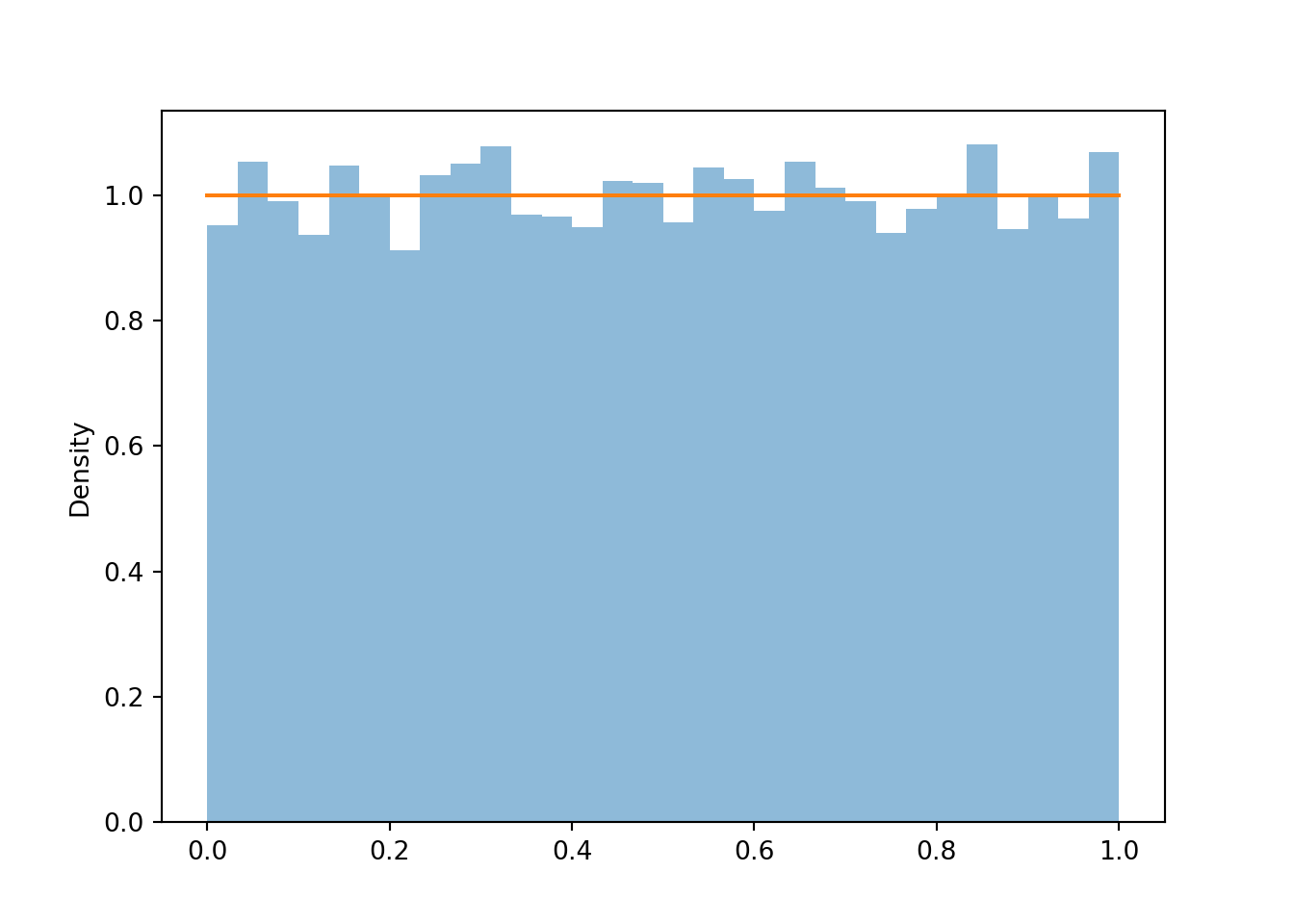
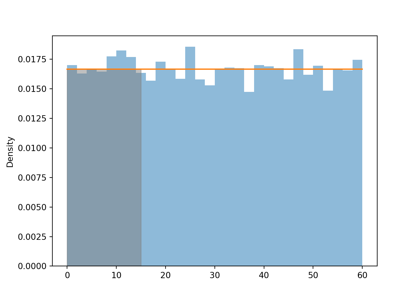
The distribution of a random variable represents its long run pattern of variation, so we won’t get a very clear picture with just 100 simulated values. Now we simulate many values of \(U\) and summarize them. We see that the histogram bars all have roughly the same height, represented by the horizontal line, and hence roughly the same area/relative frequency, though there are some natural fluctuations due to the randomness in the simulation.
u = U.sim(10000)plt.figure()u.plot() # histogram of simulated valuesUniform(0, 1).plot();# plots the horizontal line of constant height
<symbulate.distributions.Uniform object at 0x000002647C4842D0>
plt.show()
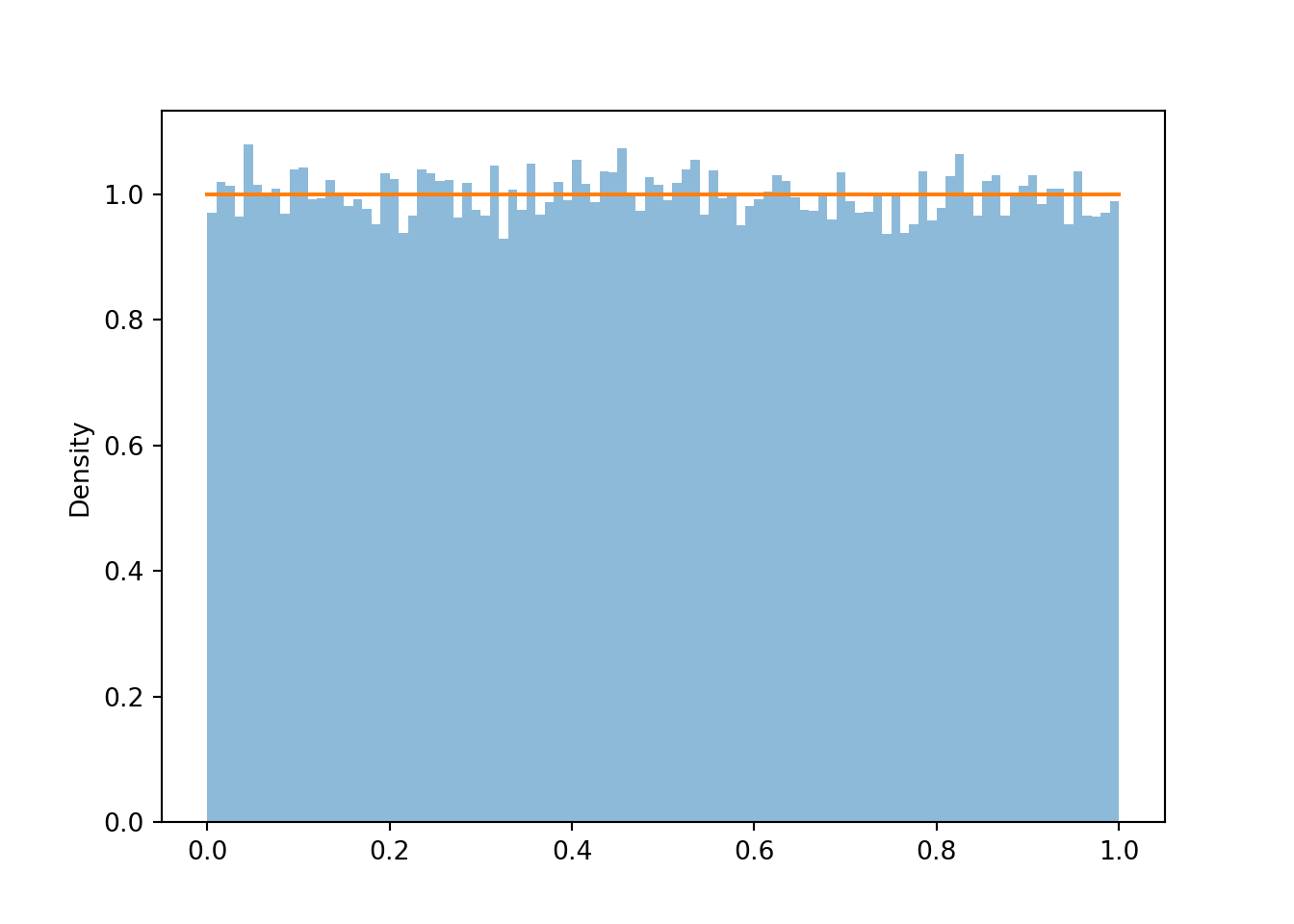
If we simulate even more values and use even more bins, we can see that the density height is roughly the same for all possible value (aside from some natural simulation variability). This “curve” with constant height over [0, 1] is called the “Uniform(0, 1) density”.
u = U.sim(100000)plt.figure()u.plot(bins =100) # histogram of simulated valuesUniform(0, 1).plot();# plots the horizontal line of constant height
<symbulate.distributions.Uniform object at 0x000002647CC36E90>
plt.show()
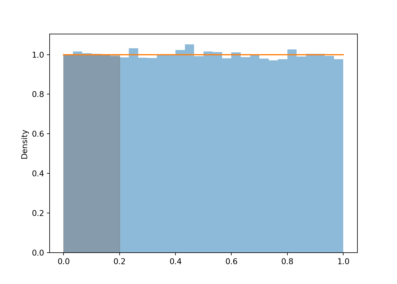
We can approximate the probability that \(U\) is less than 0.2 by the corresponding relative frequency.
u.count_lt(0.2) / u.count()
0.20074
Area represents relative frequency/probability for histograms/densities. The total area under a density curve must be 1 to account for 100% probability. The Uniform(0, 1) density has a constant height of 1 over the range [0, 1], so the total area under the curve—a rectangle with base 1 and height 1—is 1. We can compute \(\textrm{P}(U < 0.2)\) as the area under the Uniform(0, 1) density over the range [0, 0.2], a rectangle with base 0.2 and height 1, so \(\textrm{P}(U < 0.2) = 0.2\).
plt.figure()u.plot() # histogram of simulated valuesUniform(0, 1).plot().shade(lt =0.2) # Uniform(0, 1) density with area less than (lt) 0.2 shaded
<symbulate.distributions.Uniform object at 0x000002647C36FE10>
plt.show()
Example 5.1 Let \(U\) be a random variable with a Uniform(0, 1) distribution. Suppose we want to approximate \(\textrm{P}(U = 0.2)\); that is, \(\textrm{P}(U = 0.2000000000000000000000\ldots)\), the probability that \(U\) is equal to 0.2 with infinite precision.
Use simulation to approximate \(\textrm{P}(U = 0.2)\).
What do you notice? Why does this make sense?
Use simulation to approximate \(\textrm{P}(|U - 0.2|<0.005) = \textrm{P}(0.195 < U < 0.205)\), the probability that \(U\)rounded to two decimal places is equal to 0.2.
Use simulation to approximate \(\textrm{P}(|U - 0.2|<0.0005) = \textrm{P}(0.1995 < U < 0.2005)\), the probability that \(U\)rounded to three decimal places is equal to 0.2.
Explain why \(\textrm{P}(U = 0.2) = 0.\) Also explain, why this is not a problem in practical applications.
Solution (click to expand)
Solution 5.1.
No matter how many values we simulate, the simulated frequency of 0.2000000000000000000000 is going to be 0.
Any value in the uncountable, continuous interval [0, 1] is possible. The chance of getting 0.2000000000000000000, with infinite precision, is 0.
While no simulated value is equal to 0.2, about 1% of the simulated values are within 0.005 of 0.2.
While no simulated value is equal to 0.2, about 0.1% of the simulated values are within 0.0005 of 0.2.
See below for discussion.
u.count_eq(0.2000000000000000000000)
0
u.filter_lt(0.205).filter_gt(0.195)
Index
Result
0
0.20209075818497768
1
0.20221191664391913
2
0.19538897667203747
3
0.20134374122617682
4
0.20034832202460529
5
0.2014014161209493
6
0.20426156537169382
7
0.19514279771969245
8
0.1999961857120538
...
...
1033
0.2038459479990108
abs(u -0.2).count_lt(0.01/2) / u.count()
0.01034
u.filter_lt(0.2005).filter_gt(0.1995)
Index
Result
0
0.20034832202460529
1
0.1999961857120538
2
0.20033057835459012
3
0.19995781173454918
4
0.19951906309373868
5
0.19993420368524872
6
0.2001700511504625
7
0.20016631921165484
8
0.19966398783097716
...
...
114
0.19981774373195227
abs(u -0.2).count_lt(0.001/2) / u.count()
0.00115
Example 5.1 is a reminder of the discussion in Section 2.4.3. The probability that a continuous random variable \(X\) equals any particular value is 0. A continuous random variable can take uncountably many distinct values. Simulating values of a continuous random variable corresponds to an idealized spinner with an infinitely precise needle which can land on any value in a continuous scale. Of course, infinite precision is not practical, but continuous distributions are often reasonable and tractable mathematical models.
In the Uniform(0, 1) case, \(0.200000000\ldots\) is different than \(0.200000000010\ldots\) is different than \(0.2000000000000001\ldots\), etc. Consider the spinner in Figure 5.1 (a). The spinner in the picture only has tick marks in increments of 0.01. When we spin, the probability that the needle lands closest to the 0.2 tick mark is 0.01. But if the spinner were labeled in 1000 increments of 0.001, the probability of landing closest to the 0.2 tick mark is 0.001. And with four decimal places of precision, the probability is 0.0001. And so on. The more precise we mark the axis, the smaller the probability the spinner lands closest to the 0.2 tick mark. The Uniform(0, 1) density represents what happens in the limit as the spinner becomes infinitely precise. The probability of landing closest to the 0.2 tick mark gets smaller and smaller, eventually becoming 0 in the limit. In terms of density, the region under the Uniform(0, 1) density over the point 0.2 is a line segment with no area.
Even though any specific value of a continuous random variable has probability 0, intervals can have positive probability. In particular, the probability that a continuous random variable is “close to” a specific value can be positive. For example, \(\textrm{P}(|U - 0.2|<0.005) = \textrm{P}(0.195 < U < 0.205)\) corresponds to the area under the Uniform(0, 1) density over the range [0.195, 0.205], a rectangle with base 0.01 and height 1, so \(\textrm{P}(0.195 < U < 0.205) = 0.01\). If “close to” means “rounded to two decimal places”, then the probability that \(U\) is close to 0.2 is 0.01.
In practical applications involving continuous random variables we always have some reasonable degree of precision in mind. For example, if we’re interested in the probability that the high temperature tomorrow is 70 degrees F, we’re talking to the nearest degree, or maybe 0.1 degrees, but not “exactly equal to 70.0000000000000”. In practical applications involving continuous random variables, “equal to” really means “close to”, and “close to” probabilities correspond to intervals which can have positive probability.
5.2 Uniform distributions
The Uniform(0, 1) distribution is just one particular Uniform distribution. A Uniform distribution has two parameters: the smallest and largest possible values of the variable. Any Uniform distribution has the same shape: the density is constant (flat) over the range of possible values (and the density is 0 otherwise). The spinner corresponding to a Uniform distribution will have evenly spaced values around the circular axis (that is, the cirular axis has a linear scale).
We have previously encountered a Uniform(0, 60) distribution; see Example 2.32 and Example 3.3. Figure 3.3 displays a Uniform(0, 60) spinner; notice that the values are evenly spaced between 0 and 60. Let \(X\) be the random variable representing the result of a single spin of the Uniform(0, 60) spinner. The following Symbulate code defines this RV then simulates and summarizes values of it.
X = RV(Uniform(0, 60))x = X.sim(10000)x
Index
Result
0
43.590818425770145
1
33.925863043374264
2
23.20466261548968
3
29.61137802401359
4
41.51972563742854
5
13.83052655378128
6
37.152598009545265
7
22.581342084488153
8
21.112286843675527
...
...
9999
0.8241841232714453
plt.figure()x.plot() # histogram of simulated valuesUniform(0, 60).plot().shade(lt =15) # Uniform(0, 60) density
<symbulate.distributions.Uniform object at 0x000002647C33A450>
plt.show()
x.count_lt(15) / x.count()
0.2553
Remember that in a histogram, area represents relative frequency. The Uniform(0, 60) distribution covers a wider range of possible values than the Uniform(0, 1) distribution. The density is still constant but notice how the values on the vertical density axis change to compensate for the longer range on the horizontal variable axis. The histogram bars now all have a height of roughly \(\frac{1}{60} = 0.0167\) (aside from natural simulation variability). The total area of the rectangle with a height of \(\frac{1}{60}\) and a base of \(60-0\) is 1. Since the density height is constant, probabilities are represented by areas of rectangles, e.g., \(\textrm{P}(X < 15) = (15-0)(1/60) = 0.25\).
The constant height property of a Uniform distribution corresponds to the general behavior of Uniform probability measures introduced in Section 2.4.3. A single continuous random variable takes values along a number line. If a random variable has a Uniform distribution, the probability that the random variable lies in a certain interval of the number line is proportional to the length of the interval, namely, the length of the interval of interest divided by the length of the interval of possible values.
5.3 Introduction to non-uniform densities
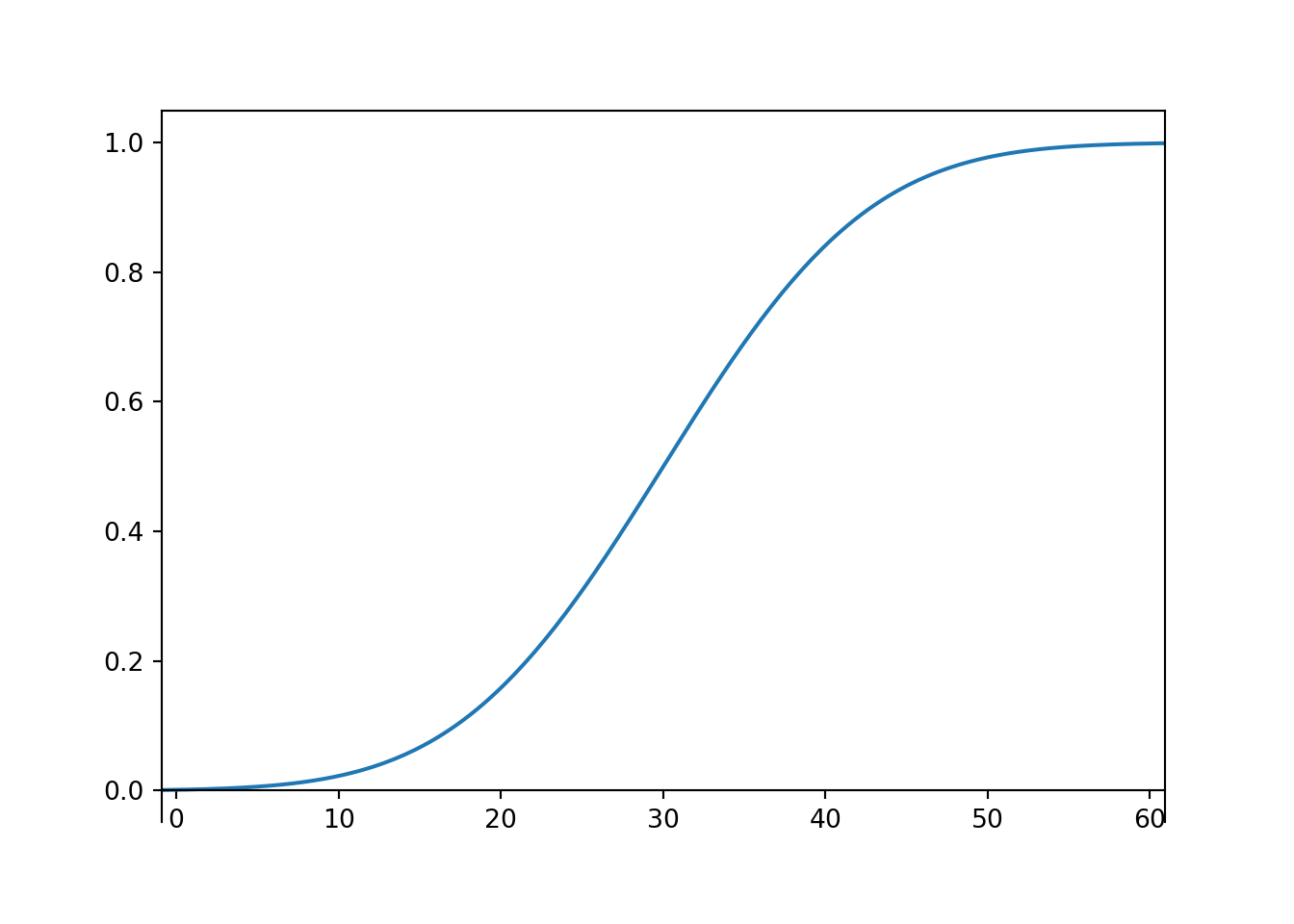
Most interesting random variables do not have Uniform distributions. We’ll now start to investigate non-uniform densities. Throughout this section we’ll consider the Normal(30, 10) distribution that we have used in Section 3.2 and Section 3.4 to simulate arrival times in the meeting problem. We’ll use spinners and histograms to motivate the shape of the Normal(30, 10) density.
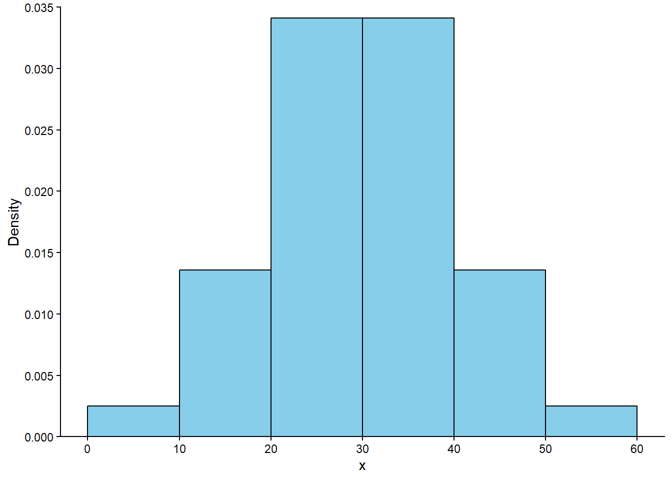
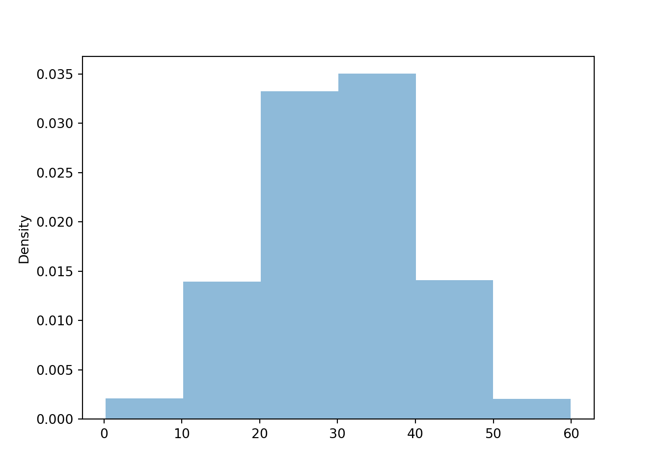
Example 5.2 Suppose we use the Normal(30, 10) spinner in Figure 3.7 to simulate many values. What would a histogram of the simulated values look like? Use Example 3.4 and the discussion following it to sketch a histogram with six bins with cutoffs 0, 10, 20, 30, 40, 50, 60. What should the areas of the histogram bars be? The density heights? What does the shape of the histogram tell you, roughly, about the distribution of values?
Solution (click to expand)
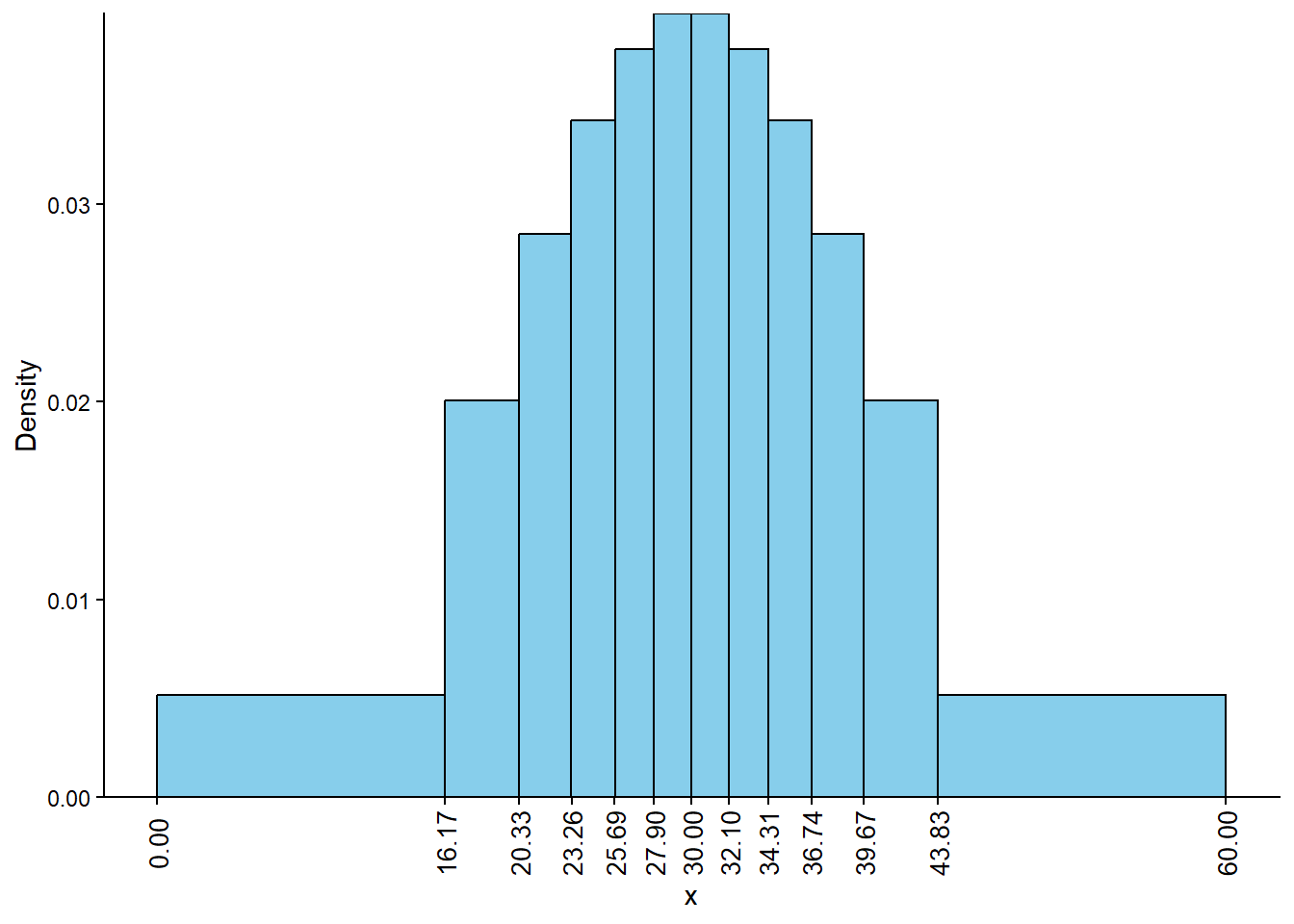
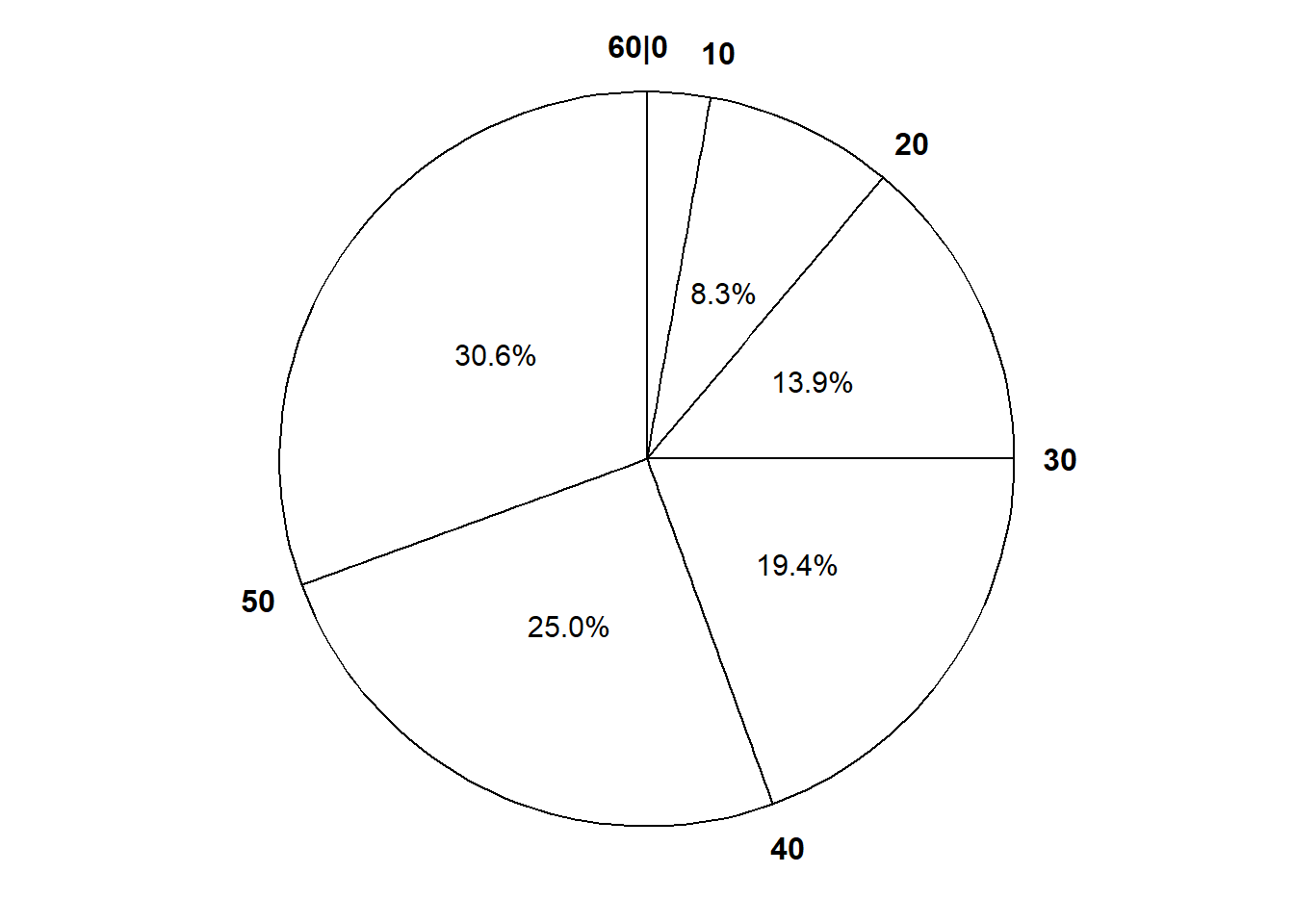
Solution 5.2. Example 3.4 and Table 3.4 show that the interval [0, 10] corresponds to a probability of 0.025, so the area of the histogram bar for the [0, 10] bin should be 0.025. Since the base of this bar has length 10, the height of the bar should be 0.025/10; that is, the density for [0, 10] should be 0.0025. Similarly, the density for [50, 60] should be 0.0025, while the density for each of [10, 20] and [40, 50] should be 0.135/10 = 0.0136, and the density for each of [20, 30] and [30, 40] should be 0.341/10 = 0.0341. Figure 5.2 sketches a histogram with these six bins and the corresponding density heights; the areas of the bars correspond to the areas of the sectors of the spinner in Figure 3.7 (b). The shape of this distribution indicates that values are more likely to be near 30 and less likely to be near 0 or 60.
Figure 5.2
Let’s try to fill in more of the shape of the Normal(30, 10) distribution.
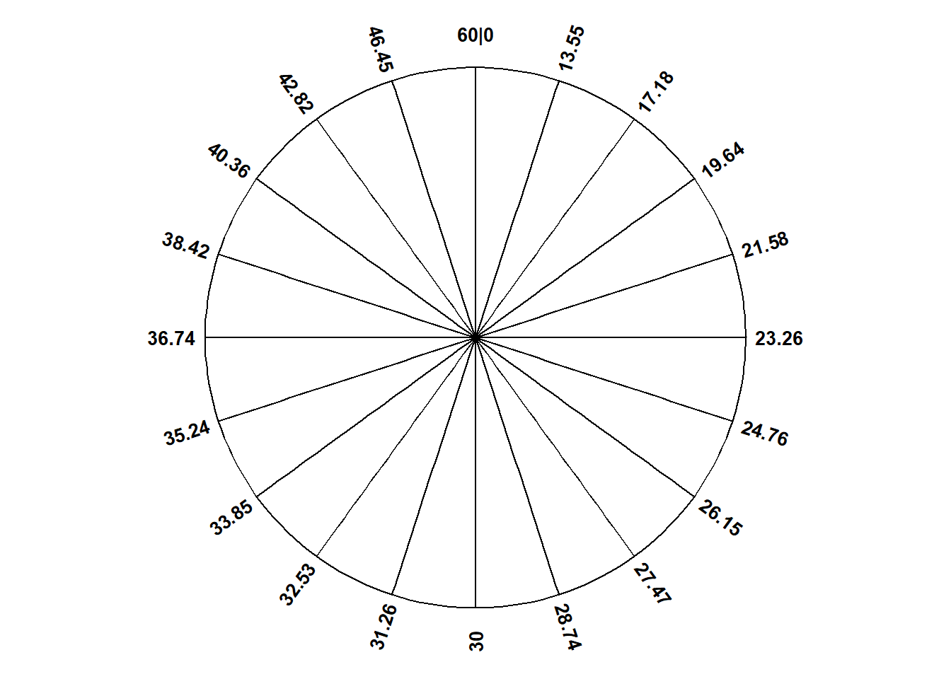
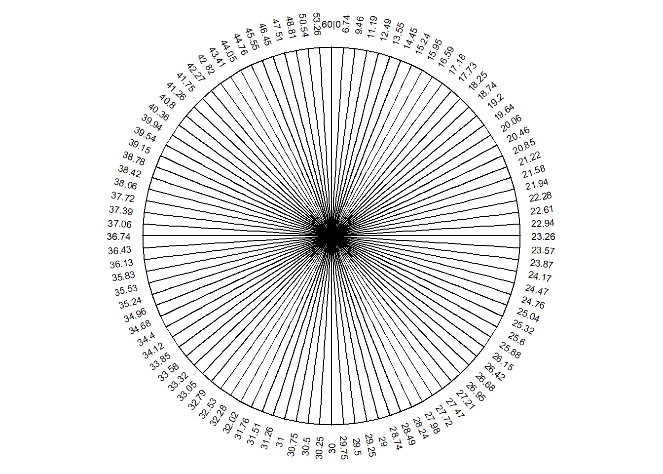
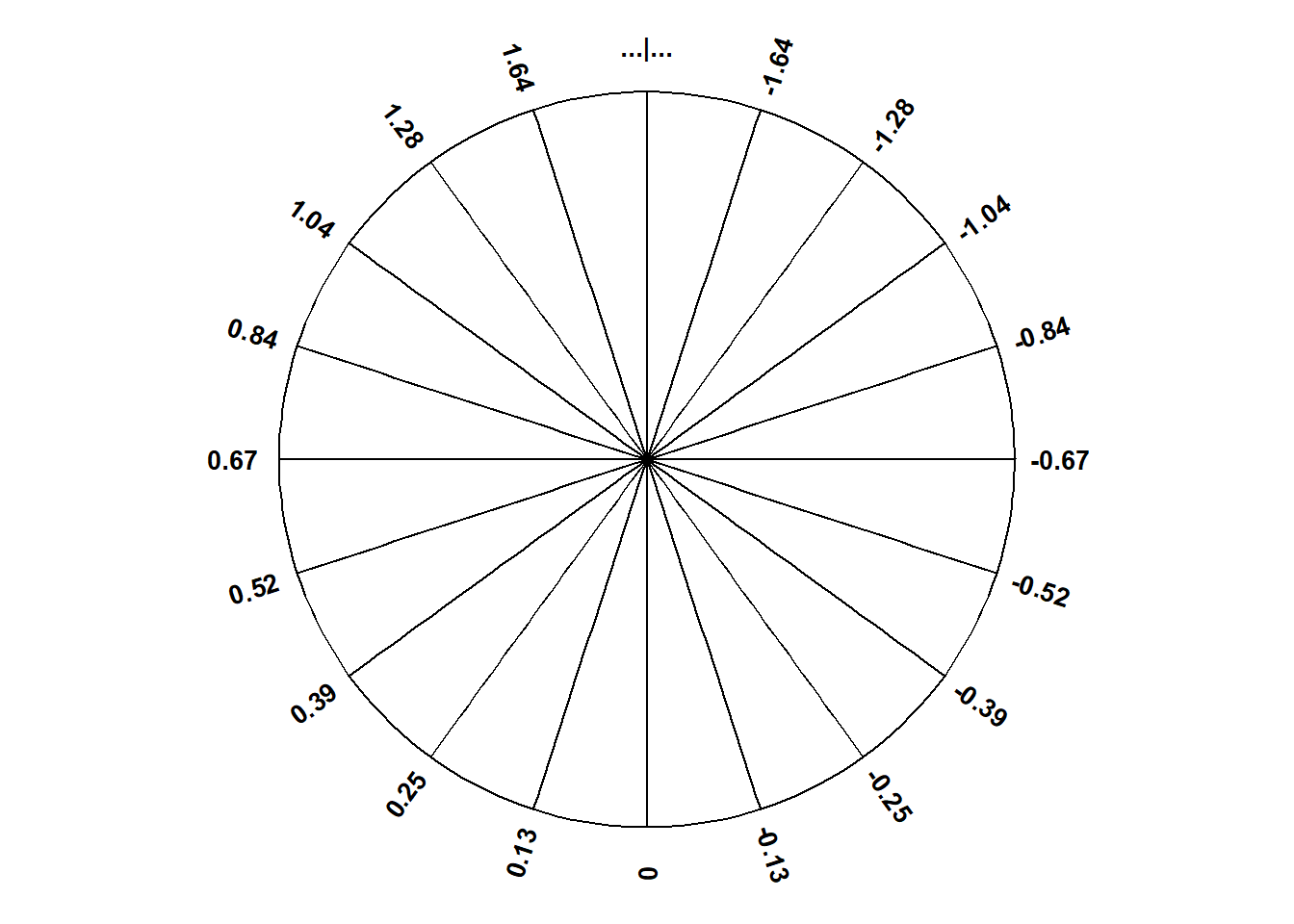
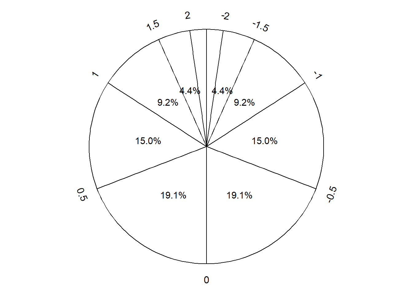
Example 5.3 Suppose we use the Normal(30, 10) spinner in Figure 3.7 to simulate many values. In Figure 3.7 (a) the spinner has been divided into 12 sectors, each with equal area. Pay close attention to the values on the spinner axis; they do not follow a linear scale.
Sketch a histogram corresponding to Figure 3.7 (a) with 12 bins of unequal width. What should the area of each histogram bar be? What should the density heights of the bars be? Be careful! The variable axis of the histogram should still be a number line with linear scale—e.g., the interval [0, 10] should be the same length as the interval [10, 20]—but the histogram bins will not have the same width.
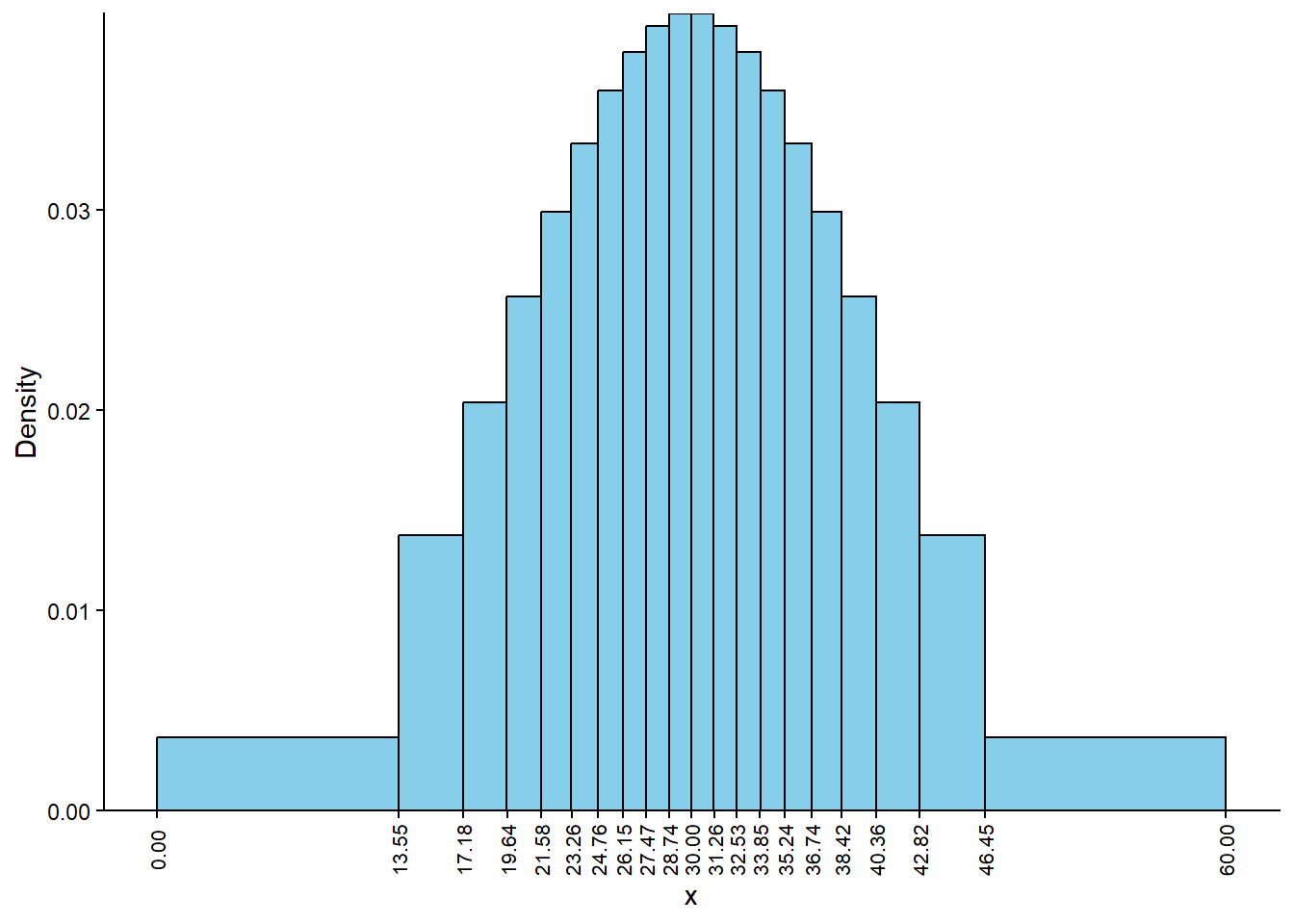
Figure 5.3 fills in more detail for the Normal(30, 10) spinner. (You can check that Figure 5.3 is consistent with Figure 3.7.) Sketch a histogram corresponding to Figure 5.3 (a) with 20 bins of unequal width.
Figure 5.3 (b) fills in even more detail. Sketch a smooth curve that describes the shape of the Normal(30, 10).
(a) Each sector is 5% of the total area
(b) Each sector is 1% of the total area
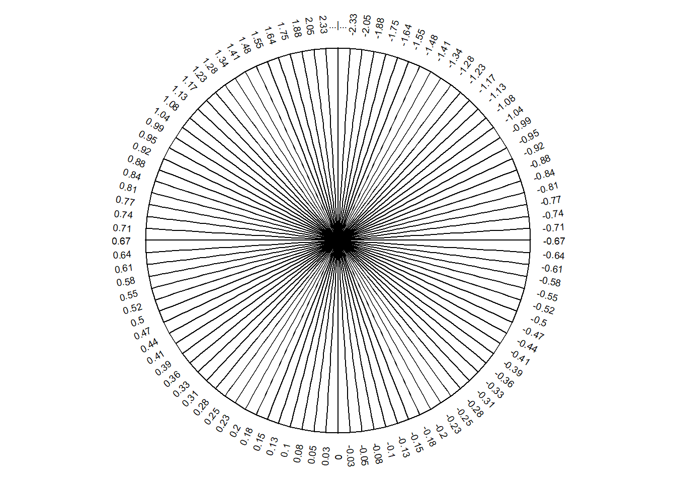
Figure 5.3: A continuous Normal(30, 10) spinner. The same spinner is displayed on both sides, with different features highlighted on the left and right. Only selected rounded values are displayed, but in the idealized model the spinner is infinitely precise so that any real number is a possible outcome. Notice that the values on the axis are not evenly spaced.
Solution (click to expand)
Solution 5.3.
Each histogram bar will correspond to a sector of the spinner, so each histogram bar will have area 1/12. However, since the widths of the bars are unequal, the heights of the bars will also be unequal. For example, there will be a bin for:
[0, 13.55] with an area of 1/12 and a density height of \((1/12)/(13.55 - 0 ) = (1/12) / 13.55 = 0.0062\)
[13.55, 17.18] with an area of 1/12 and a density height of \((1/12)/(17.18 - 13.55) = (1/12)/3.63 = 0.0230\)
[17.18, 19.64] with an area of 1/12 and a density height of \((1/12)/(19.64 - 17.18) = (1/12)/2.46 = 0.0339\)
and so on, until
[42.82, 46.45] with an area of 1/12 and a density height of \((1/12)/(46.45 - 42.82) = (1/12)/3.63 = 0.0230\)
[46.45, 60] with an area of 1/12 and a density height of \((1/12)/(60 - 46.45 ) = (1/12) / 13.55 = 0.0062\).
See Figure 5.4. Each bar of the histogram has the same area6, but different widths and heights.
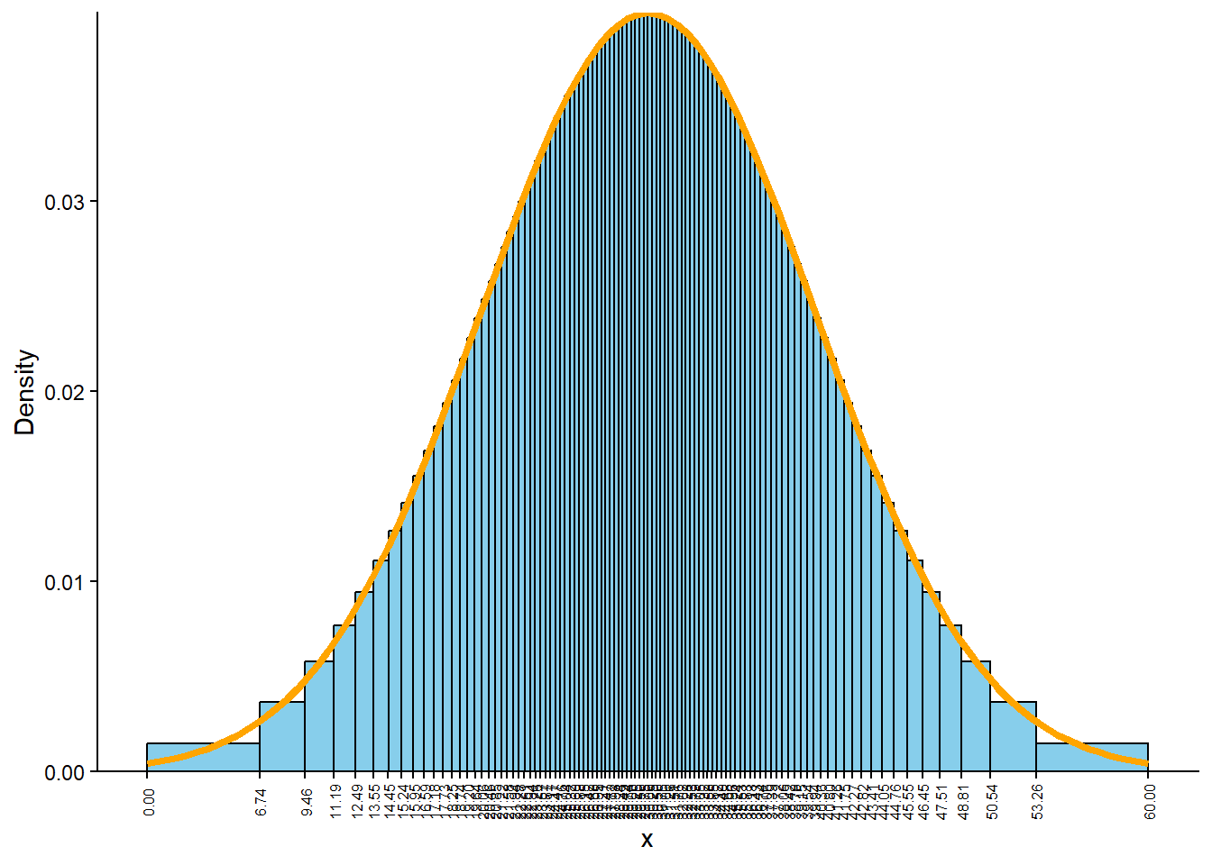
The process is similar to the previous part, but now each sector and each histogram bin has area 0.05. See Figure 5.5 (a).
As we refine the spinner, the histogram starts to have a smooth symmetric, bell shape. See Figure 5.5 (b).
Figure 5.4: Histogram corresponding to the spinner in Figure 3.7 (a). All bars have the same area (1/12), but the bin widths are unequal.
(a) Histogram corresponding to Figure 5.3 (a). Each bar has 5% of the total area
(b) Histogram corresponding to Figure 5.3 (b). Each bar has 1% of the total area
Figure 5.5: Histograms corresponding to a Normal(30, 10) distribution. In each histogram, all bars have the same area, but the bin widths are unequal.
The histograms with unequal bin widths in Example 5.3 help illustrate how their shape corresponds to equal-area-sectors of spinners, but in practice we usually use histograms with equal bin widths.
Example 5.2 and Example 5.3 suggest a smooth, symmetric bell shape for a Normal(30, 10) density. Now we’ll investigate further via simulation. We first define a Symbulate RV by specifying its marginal distribution.
X = RV(Normal(30, 10))
Now we simulate a few values and plot them.
x = X.sim(100)x
Index
Result
0
36.90890322302815
1
20.060724409778246
2
50.70042681017063
3
53.32332269643602
4
35.62495353302863
5
26.027063396720038
6
37.577855701629915
7
33.750644548678316
8
24.420307072929553
...
...
99
15.925858145464524
plt.figure();x.plot(['hist', 'rug'])plt.show()
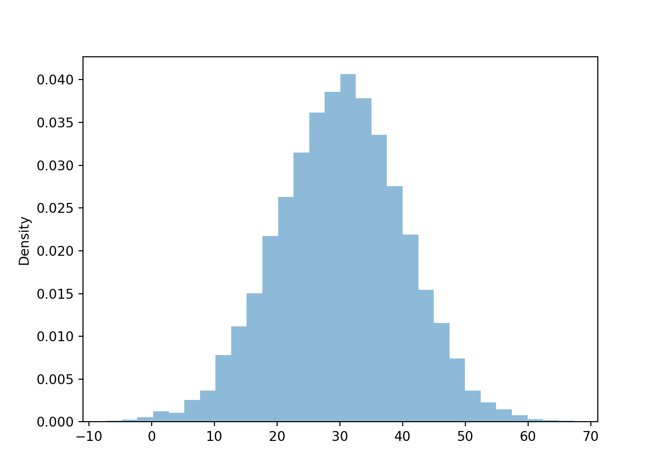
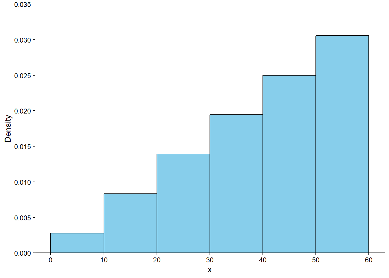
It appears that the distribution is not “flat” like in the Uniform case; values near 30 seem to occur more often than values near 0 or 60. We’ll get a much clearer picture of the distribution if we simulate many values. First we simulate 10000 values of \(X\) and summarize the simulated values in a histogram with 6 bins.
Technical note: the Normal(30, 10) spinners we have seen so far don’t exactly correspond to Normal distributions because they only return values between 0 and 60, while for a true Normal distribution any real number is a possible value. In particular, if \(X\) has a Normal(30, 10) distribution, the probability that \(X\) takes a value outside of [0, 60] is about 0.003. That is, when simulating 10000 values from a Normal(30, 10) distribution we would expect to see around 30 values outside of [10, 60]. For direct comparison with Figure 5.2, we have discarded simulated values outside of [0, 60] using the filter functions.
x = X.sim(10000)plt.figure();x.filter_gt(0).filter_lt(60).plot(bins =6)plt.show()
Figure 5.6
We see that the pattern of variability of the simulated values matches what we expected in Figure 5.2. What about a histogram with more bins? (From now on, we’ll summarize all simulated values, including those outside of [0, 60].)
plt.figure();x.plot();plt.show()
We start to see a symmetric bell-shaped pattern, but the histogram is still “chunky”. Imagine that we
keep simulating more and more values, and
make the histogram bin widths smaller and smaller.
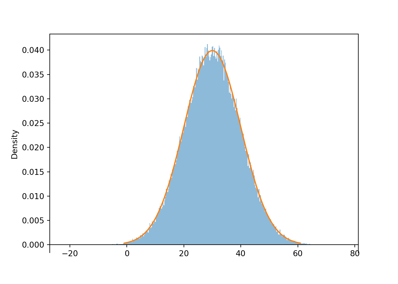
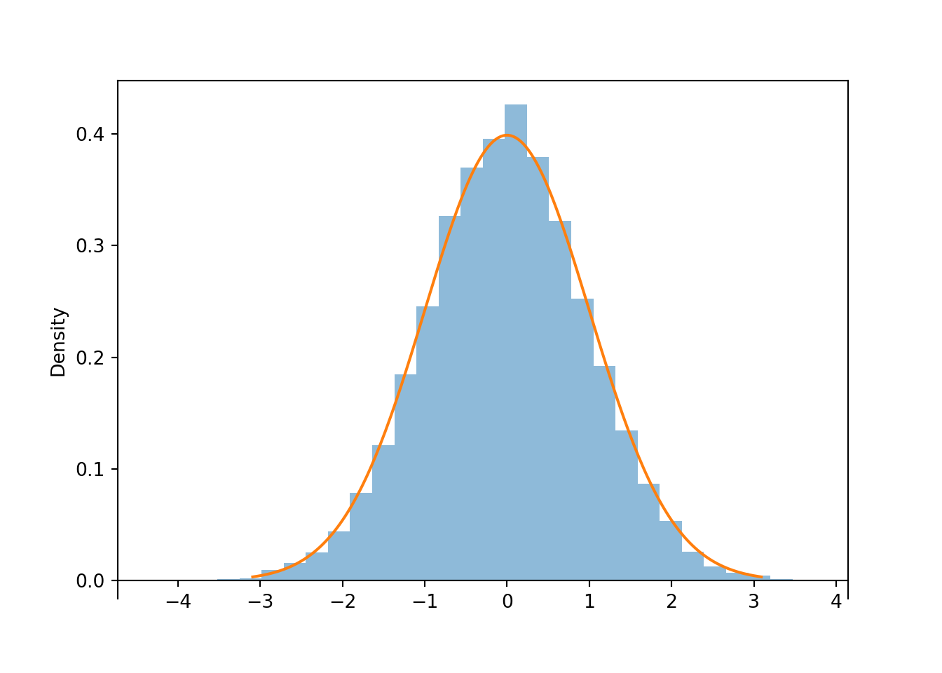
Then the “chunky” histogram would get “smoother”. The following plot summarizes the results of 100,000 simulated values in a histogram with 360 bins of equal width. (In the arrival time context, each bin corresponds to roughly a one second interval.) The command Normal(30, 10).plot() overlays the smooth curve modeling the theoretical shape of the distribution of \(X\). This curve is an example of a probability density function (pdf, or simply “density”).
x = X.sim(100000)plt.figure();x.plot(bins =360) # histogram of simulated valuesNormal(30, 10).plot() # plot the Normal(30, 10) density curve
<symbulate.distributions.Normal object at 0x000002647CC0BC50>
plt.show()
Figure 5.7: Histogram of values simulated from a Normal(30, 10) distribution. The smooth solid curve models the theoretical probability density function.
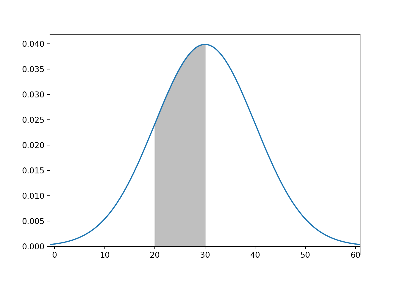
The bell-shaped curve depicting the Normal(30, 10) density is one probability density function. Probability density functions for continuous random variables are analogous to probability mass functions for discrete random variables. However, while they play analogous roles, they are different in one fundamental way; namely, a probability mass function outputs probabilities directly, while a probability density function does not. A probability density function only provides the density height; the area under the density curve determines probabilities. See Figure 5.8 for an example. We will investigate densities in general, as well as Normal distributions, in more detail later.
<symbulate.distributions.Normal object at 0x0000026400B2C190>
plt.show()
Figure 5.8: Normal(30, 10) density; shaded area represents (roughly) 34.1% of the area under the curve and corresponds to the probability that the variable takea a value between 20 and 30.
The examples in this section illustrate that we can construct a spinner to represent a particular distribution by stretching intervals with high probability and shrinking intervals with low probability in just the right way. But what is “just the right way”? For example, how did we know where to put the values on the spinner axis in Figure 5.3 to achieve the particular bell shape of the Normal(30, 10) distribution? The key to understanding the shape of a distribution—and to constructing a spinner to represent it—is provided by percentiles.
5.4 Percentiles
We have all encountered percentiles at some point in our lives, perhaps in a context like the following.
Example 5.4 Maggie and Seamus are babies who have just turned one. At their one-year visits to their pediatrician:
75% of one-year-old females are less than 76cm tall, and 25% are more than 76cm tall. So Maggie is taller than 75% of one-year-old females.
10% of one-year-old males are less than 72cm tall, and 90% are more than 72cm tall. So the wee baby Seamus is taller than only 10% of one-year-old boys.
A distribution is basically just a collection of percentiles. Roughly, the value \(x\) is the \(p\)th percentile (a.k.a. quantile) of a distribution of a random variable \(X\) if \(p\) percent of values of the variable are less than or equal to \(x\): \(\textrm{P}(X\le x) = p\). Given all the percentiles we can determine the probability that the random variable lies in any interval.
Percentiles commonly reported in summaries include:
The median, that is, 50th percentile
The first (or lower) quartile, that is, the 25th percentile
The third (or upper) quartile, that is, the 75th percentile
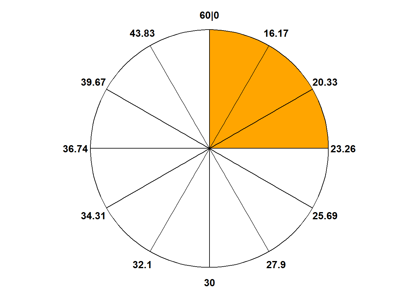
Example 5.5 Recall that the spinner in Figure 3.7 represents the Normal(30, 10) distribution. According to this distribution:
What percent of values are less than 23.26?
What is the 25th percentile?
What is the 75th percentile?
A value of 40 corresponds to what percentile?
What percent of values are between 23.26 and 40?
Solution (click to expand)
Solution 5.5.
25% of values are less than 23.26.
The previous part implies that 23.26 is the 25th percentile.
75% of values are less than 36.74, so 36.74 is the 75th percentile.
40 is (roughly) the 84th percentile. About 84% of values are less than 40.
About 84% of values are less than 40 and about 25% values are less than 23.26, so about 59% of values are between 23.26 and 40.
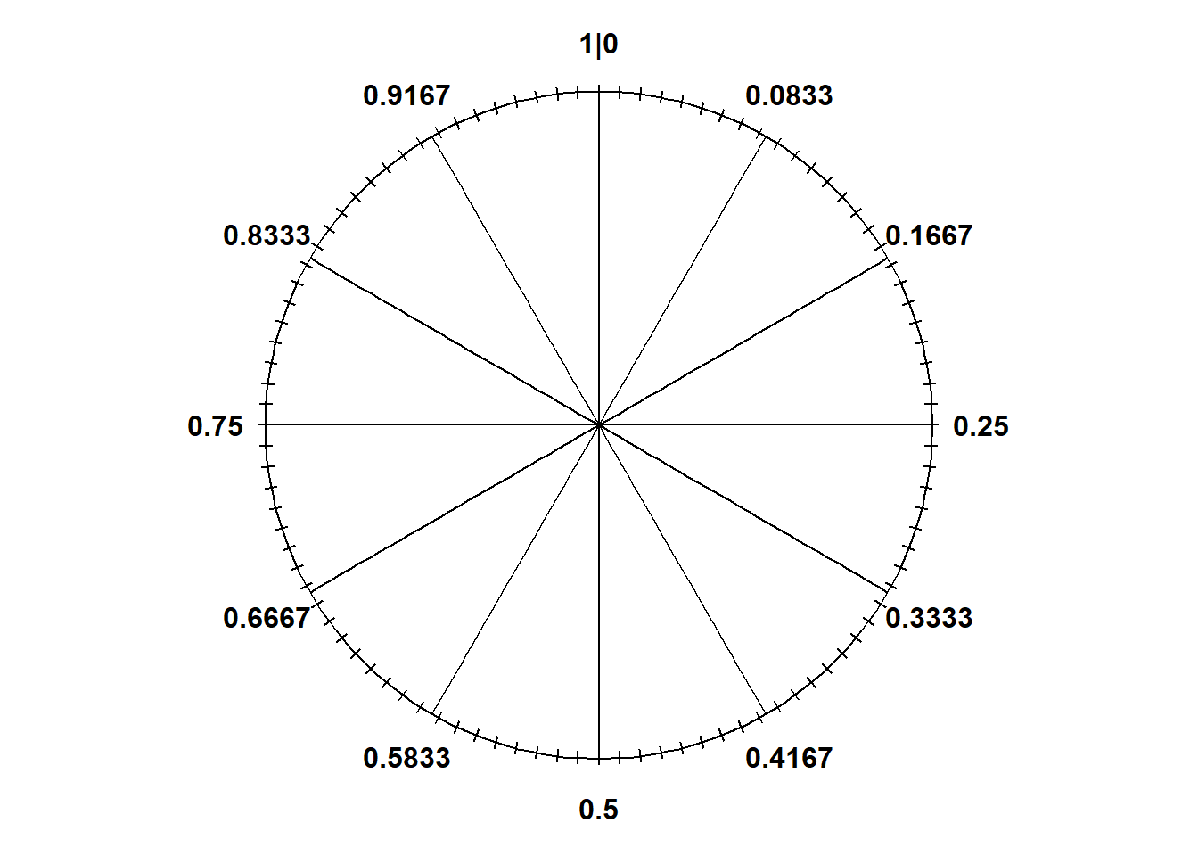
A spinner describes a distribution by basically representing all its percentiles.
The 25th percentile goes 25% of the way around the axis (at “3 o’clock”)
The 50th percentile goes 50% of the way around the axis (at “6 o’clock”)
The 75th percentile goes 75% of the way around the axis (at “9 o’clock”)
And so on. Filling in the circular axis of the spinner with the appropriate percentiles determines the probability that the random variable lies in any interval.
In Symbulate, percentiles of simulated values can be computed using quantile(p) where p is between 0 and 1, e.g., p = 0.25 for the 25th percentile.
X = RV(Normal(30, 10))x = X.sim(10000)x.quantile(0.25)
23.461185023256448
x.quantile(0.75)
36.68425744483258
x.quantile(0.84)
39.716564113778006
x.quantile(0.975)
49.697610575800546
Remember, we’re dealing with simulated values so they won’t follow the theoretical distribution exactly.
For named distributions, we can also compute quantiles of the theoretical distribution in Symbulate using code of the form Distribution(parameters).quantile(p).
Normal(30, 10).quantile(0.25)
np.float64(23.255102498039182)
Normal(30, 10).quantile([0.75, 0.84, 0.975])
array([36.7448975 , 39.94457883, 49.59963985])
Continuing in this way we can fill in the rest of the axis labels on the Normal(30, 10) spinner. For example, Normal(30, 10).quantile(0.854) tells us the value that should go 85.4% of the way around the spinner axis (at “10:15”); roughly Normal(30, 10).quantile([0.01, 0.02, ..., 0.99, 0.99]) defines the spinner in Figure 5.3 (b). The percentiles of the Normal(30, 10) distribution are what determine its particular bell shape, which we will study in more detail later.
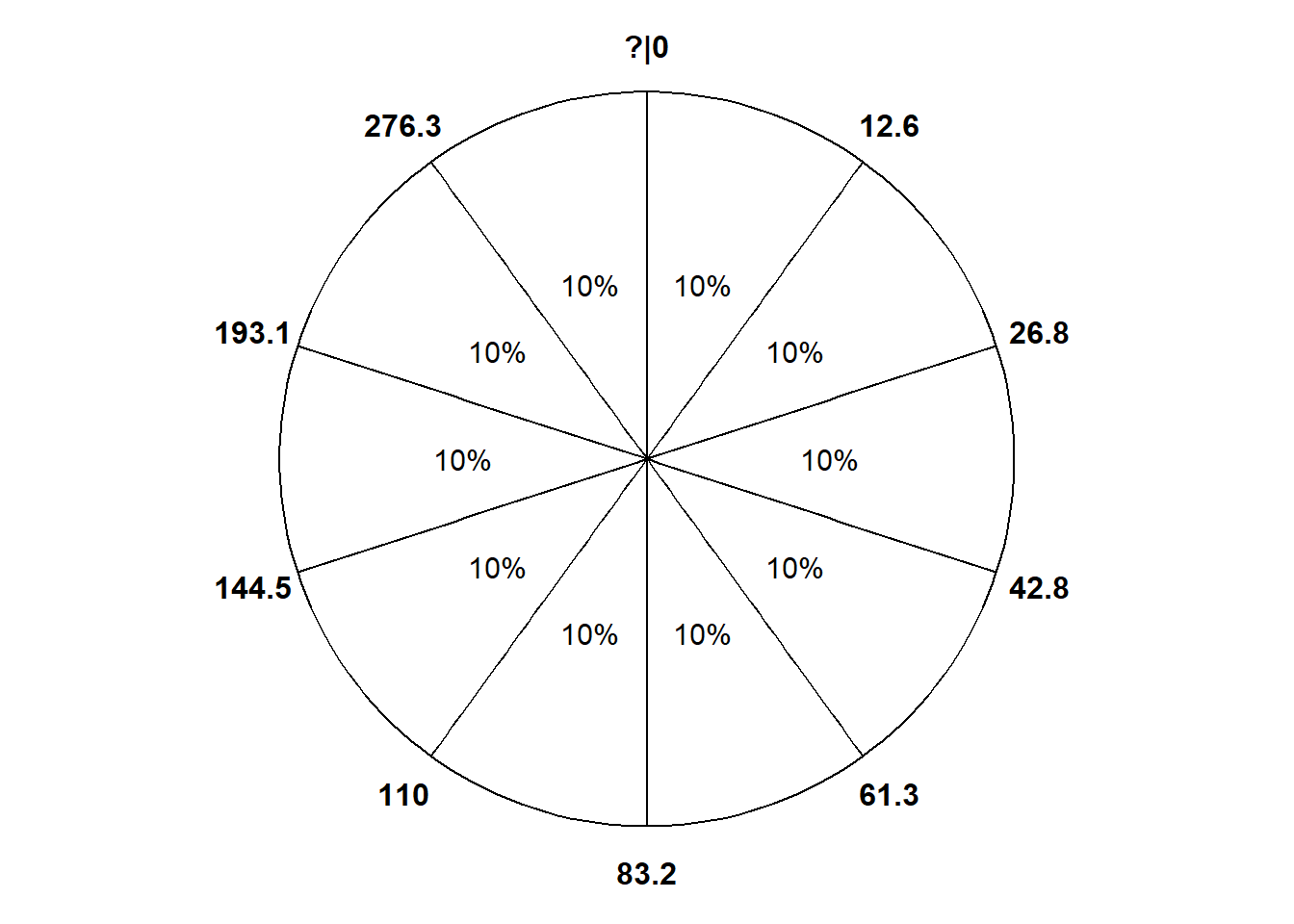
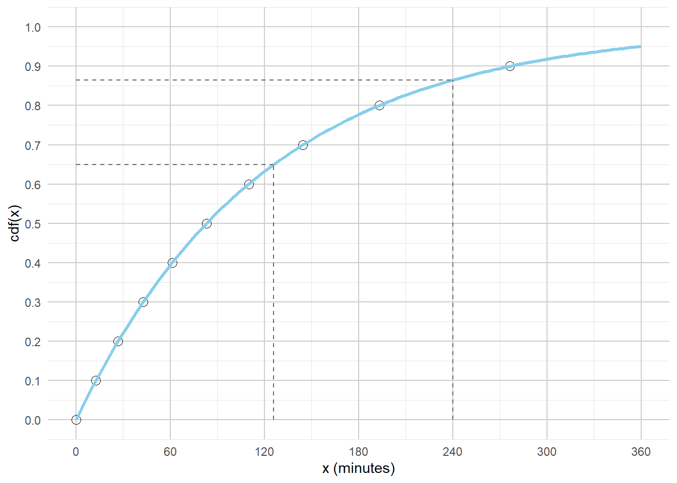
Example 5.6 In a certain region, times (minutes) between occurrences of earthquakes (of any magnitude) have a distribution with percentiles displayed in Table 5.1.
Construct a spinner corresponding to this distribution.
Sketch a histogram of this distribution with unequal bin widths. What might a smooth density look like?
Sketch a histogram of this distribution with equal bin widths.
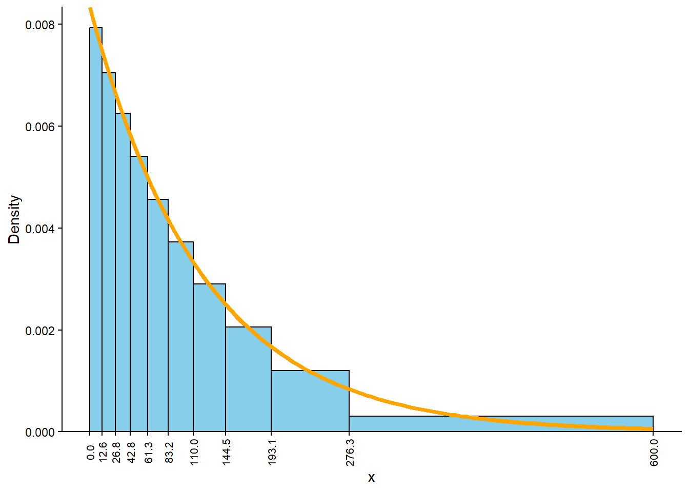
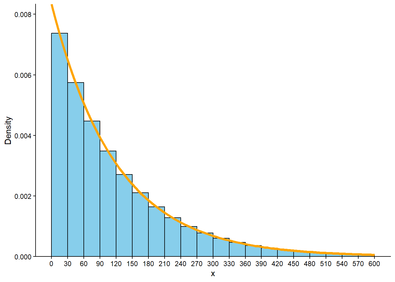
Since \(X\) measures times between earthquakes, the smallest possible value of \(X\) is 0 but there is no fixed upper bound. Create a spinner with 10 equal sectors with an axis starting from 0 at “12 o’clock”; see Figure 5.9. The 10th percentile goes 10% of the way around (a little after “1 o’clock”), the 50th percentile goes at 50% of the way around (at “6 o’clock”), etc.
We usually use with a histogram with even bins, but sometimes it helps to start sketching a histogram with uneven bins. We know that 10% of the values are between 0 and 12.6, 10% are between 12.6 and 26.8, 10% are between 26.8 and 42.8, etc. So if we split the bins of the histogram based on these percentiles, each bar would correspond to a relative frequency of 10%. But remember that in a histogram area represents relative frequency. So each of the bars would have the same area, but the bins are unequally spaced, so the bars would not have the same height. For example, the first bin has area of 10% over a base of (0, 12.6), while the 80-90 percentile bin has area 10% spread over the interval (193.1, 276.3), so the bar for (193.1, 276.3) will have a smaller height than the bar for (0, 12.6). See Figure 5.10 (a). It seems that a smooth density curve would have an exponentially decreasing shape.
We don’t have enough information to construct the histogram in detail but we can sketch a histogram with a shape similar to the one from the previous part, but now with equal bin widths. See Figure 5.10 (b). We can see that density is highest near 0 and decreases as \(x\) increases. Notice how intervals where the density is high are stretched out on the spinner axis, while regions where the density is low are shrunk. (The highest percentile provided is the 90th, so we don’t know what a reasonable upper bound for the scale is, so that almost all values would fall below it.)
Example 5.6 is an example of an Exponential distribution. We will study Exponential distributions in more detail later, including some situations (like times between earthquakes) where Exponential distributions are reasonable models based on real data.
5.5 Cumulative distribution functions and quantile functions
A distribution of a continuous random variable is a collection of percentiles. The more percentiles we provide, the fuller the description of the distribution, the finer we can make the corresponding histogram and spinner, and the better the picture of the smooth density. Now we’ll see how to specify all the percentiles to achieve a complete description of a distribution.
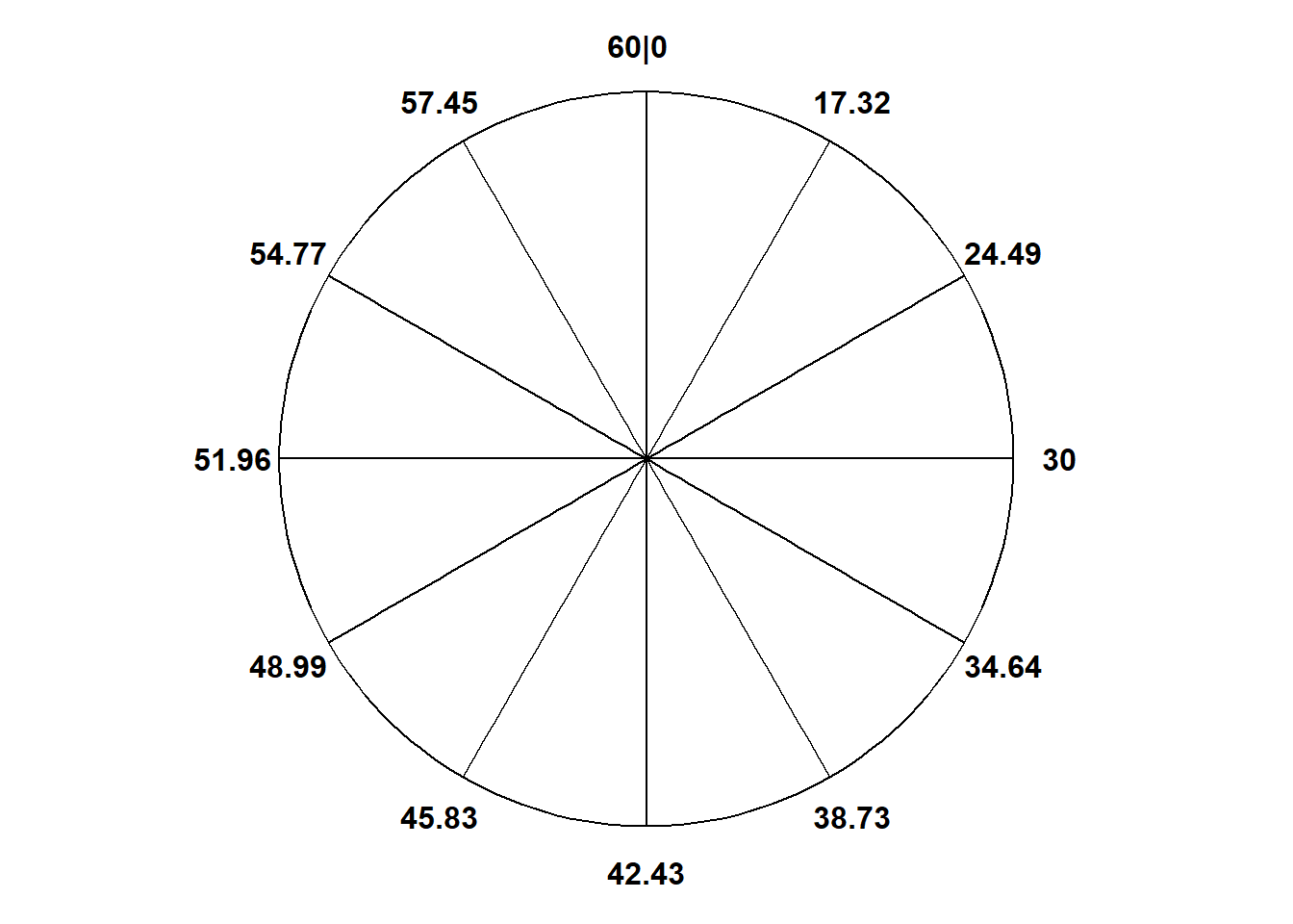
Example 5.7 Recall Example 2.33. Assume that the probability that Han arrives before time \(x\) (minutes after noon) is \((x/60)^2\) for \(0\le x\le 60\). Let \(X\) be the random variable representing Han’s arrival time.
Compute and interpret \(\textrm{P}(X \le 30)\).
Compute and interpret \(\textrm{P}(X \le 42.42)\).
Compute and interpret \(\textrm{P}(X \le 51.96)\).
What do the previous parts tell you about the percentiles of \(X\)?
Use the answers to the previous parts to start to construct a spinner for simulating values of \(X\).
How could you fill in more of the spinner? For example, where should you place the values 10, 20, 30, 40, 50 on the spinner axis?
Figure 5.11 (b) displays the spinner with the values 10, 20, 30, 40, 50 marked. Suppose this spinner is used to simulate many values of \(X\). Sketch what you would expect a histogram with 6 bins of equal width to look like. What does this say about the distribution of \(X\)?
Solution (click to expand)
Solution 5.7.
\(\textrm{P}(X \le 30) = (30 / 60)^2 = 0.25\). Over many days, Han arrives before 12:30 on 25% of days. Han is 3 times more likely to arrive after 12:30 than before.
\(\textrm{P}(X \le 42.42) = (42.42 / 60)^2 = 0.5\). Over many days, Han arrives before 12:42:42 on 50% of days. Han is equally likely to arrive after 12:42:42 as before.
\(\textrm{P}(X \le 51.96) = (51.96 / 60)^2 = 0.75\). Over many days, Han arrives before 12:51:96 on 75% of days. Han is 3 times more likely to arrive before 12:51:96 than after.
30 minutes after noon is the 25th percentile, 42.42 minutes after noon is the 50th percentile, and 51.96 minutes after noon is the 75th percentile. Roughly \((x/60)^2\) percent of values are less than \(x\), so the function \((x/60)^2\) identifies what percentile the value \(x\) is (\((x/60)^2\) returns the percentile as a decimal between 0 and 1, e.g., 0.25 corresponds to the 25th percentile).
30 would go 25% of the way around the spinner axis at the “3 o’clock” position, 42.42 at “6 o’clock”, and 51.96 at “9 o’clock”.
If we want to mark the value \(x\) on the spinner, compute \((x/60)^2\) to determine what percentile \(x\) represents and mark its position on the spinner accordingly. For example, 20 minutes after noon is the 11.1th percentile—because \((10/60)^2 = 0.111\)—so 20 goes 11.1% of the way around the spinner axis, not quite halfway between the “1 o’clock” and “2 o’clock” positions (since “1 o’clock” is 1/12=8.33% and “2 o’clock” is 2/12=16.67% of the way around). See Figure 5.11 (b); only selected values have been filled in, but we could use this method to place any value of \(x\) on the spinner axis.
Consider the [10, 20] bin. Using the cdf, \[
\textrm{P}(10 \le X \le 20) = \textrm{P}(X \le 20) - \textrm{P}(X \le 10) = (20/60)^2-(10/60)^2 = 0.1111 - 0.0278 = 0.0833
\] So the histogram bar for the [10, 20] bin has area 0.0833 and hence height 0.0833/10 = 0.0083. We can compute for the other bins similarly. See Figure 5.12. The bins have the same width but correspond to different probabilities, so the bars have different areas and heights. The areas of the histogram bars correspond to the areas of the sectors in Figure 5.11 (b). Values of \(X\) are more likely to be near 60 than near 0; compare to Example 2.33.
(a) Values at 1 o’clock, 2 o’clock, 3 o’clock, etc, corresponding to the 8.33th, 16.67th, 25th, etc, percentiles
(b) Spinner axis marked in increments of 10
Figure 5.11: A spinner representing the distribution in Example 5.7 and Example 5.8. The same spinner is displayed on both sides, with different features highlighted on the left and right. Only selected rounded values are displayed, but in the idealized model the spinner is infinitely precise so that any real number is a possible outcome. Notice that the values on the axis are not evenly spaced.
Figure 5.12
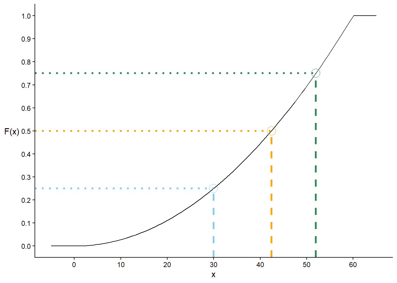
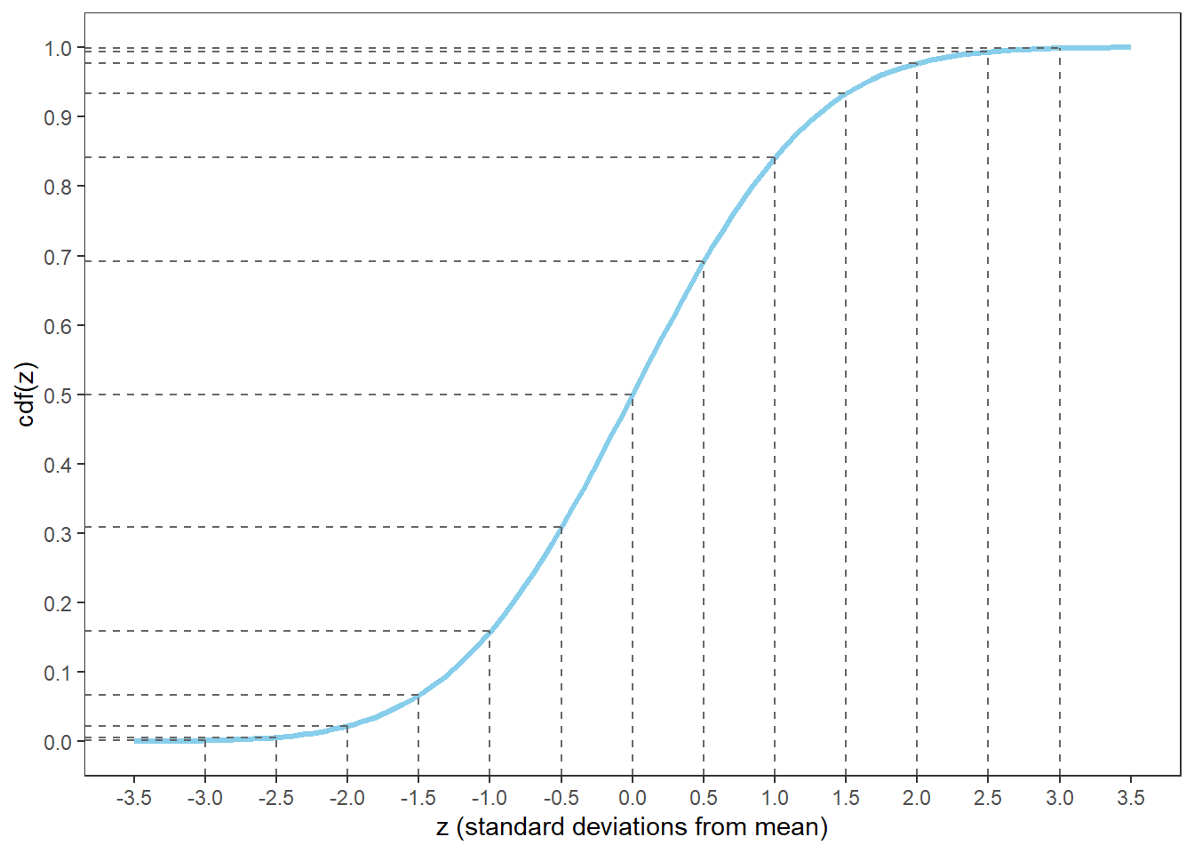
In Example 5.7 the function \((x/60)^2\) for \(0\le x\le 60\) is (roughly) the “cumulative distribution function” of \(X\). A cumulative distribution function provides a complete description of a distribution by specifying all its percentiles. The cumulative distribution function (cdf) of a random variable fills in the blank for any given \(x\): \(x\) is the (blank) percentile. That is, for an input \(x\), a value in the measurement units of the variable \(X\), the cdf outputs \(\textrm{P}(X\le x)\).
Definition 5.1 The cumulative distribution function (cdf) (of a random variable \(X\) defined on a probability space with probability measure \(\textrm{P}\)) is the function, \(F_X: \mathbb{R}\mapsto[0,1]\), defined by \(F_X(x) = \textrm{P}(X\le x)\).
Be careful with notation: A cumulative distribution function is typically denoted upper case \(F\), while a probability density function is typically denoted lower case \(f\) (and the letter “f” is for “function”).
The input \(x\) to a cdf represents a value in the measurement units of the random variable \(X\), e.g., \(x\) minutes after noon in Example 5.7. However, a cdf is defined for all real numbers \(x\) regardless of whether \(x\) is a possible value of \(X\).
In Example 5.7, even though the only possible values of \(X\) are in [0, 60], the cdf is technically \[
F_X(x) =
\begin{cases}
0, & x < 60\\
(x/60)^2, & 0\le x \le 60,\\
1, & x > 60.
\end{cases}
\] For example, \(F_X(-10) = \textrm{P}(X \le -10) = 0\) since Han can’t arrive more than 10 minutes before noon, and \(F_X(70) = \textrm{P}(X \le 70) = 1\) since Han must arrive at most 60 minutes after noon. See Figure 5.14 (a) for a plot of the cdf. Given any value \(x\) on the horizontal axis, we can read off the corresponding percentile from the cdf, e.g., 30 is the 25th percentile, 42.42 is the 50th percentile, and 51.96 is the 75th percentile.
A cdf directly provides “\(\le\)” probabilities, but we can find other probabilities by subtracting. For example, in Example 5.7, \[
\textrm{P}(30 \le X\le 40) = \textrm{P}(X \le 40) - \textrm{P}(X < 30) = F_X(40) - F_X(30) = (40/60)^2 - (30/60)^2 = 0.194
\] (Remember, for continuous random variables \(\textrm{P}(X = x) = 0\) so \(F_X(x) = \textrm{P}(X\le x) = \textrm{P}(X < x)\) if \(X\) is continuous.)
Cumulative distribution functions are defined the same way for both discrete and continuous random variables, but they are most commonly used and best understood in terms of continuous random variables. Remember that for a continuous random variable, probability is represented by area under the density curve. Imagine plotting a density curve and adding a vertical line at \(x\); \(\textrm{P}(X\le x)\) is the area under the curve to left of this line. The cdf is constructed by moving the vertical line from left to right, from smaller to larger values of \(x\), and recording the area under the curve to the left of the line, \(F_X(x) = \textrm{P}(X\le x)\), as \(x\) increases. Regarding spinners, imagine a “second hand” on the spinner starts at the smallest possible value (the “12 o’clock” position) and sweeps clockwise around the spinner as the vertical line moves from left to right. When the second hand is pointing at \(x\) on the spinner axis, the area that it has swept through represents \(\textrm{P}(X\le x)\). The cdf records the values of \(F_X(x) = \textrm{P}(X\le x)\) as the second hand moves along and points to different values of \(x\).
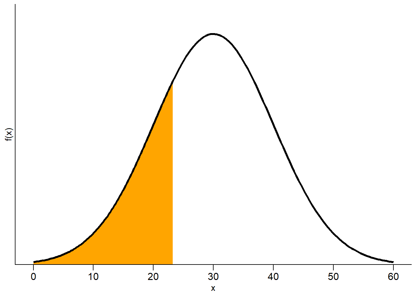
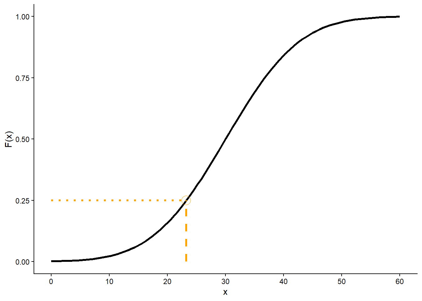
See Figure 5.13 for an illustration based on the Normal(30, 10) distribution from Section 5.3. Figure 5.13 (a) displays the Normal(30, 10) density; the shaded area represents \(F_X(23.26)=\textrm{P}(X\le 23.26)\), which is about 0.25. Figure 5.13 (b) displays the cdf. The dot on the cdf represents the point \((23.26, F_X(23.26) = 0.25)\), which indicates that 23.26 is the 25th percentile, so 23.26 is located 25% of the away around (at “3 o’clock”) on the spinner in Figure 5.13 (c). Imagine sliding the vertical bar in Figure 5.13 (a) from left to right or sweeping the “second hand” clockwise around the spinner in Figure 5.13 (a); then the dot in Figure 5.13 (b) would slide up along the cdf.
(a) pdf; shaded area represents \(F_X(23.26) = 0.25\)
(b) cdf; \(F_X(23.26) = 0.25\) is highlighted
(c) spinner; shaded area represents \(F_X(23.26) = 0.25\)
Figure 5.13: Illustration of the 25th percentile for \(X\) with a Normal(30, 10) distribution (restricted to [0, 60]).
In Figure 5.13 note that for \(x\) intervals where the density is highest, probability “accumulates more quickly” and the cdf is steep, while where the density is lowest the cdf is fairly flat. The values on the spinner axis are scaled accordingly. Intervals corresponding to higher density (“more likely values”) are stretched out on the spinner axis; intervals corresponding to lower density (“less likely values”) are shrunk. We’ll investigate the connection between densities and cdfs more closely in the next section.
For named distributions, we can evaluate the cdf in Symbulate using code of the form Distribution(parameters).cdf(value). For example, here are some cdf calculations for the Normal(30, 10) distribution; compare to earlier examples.
<symbulate.distributions.Normal object at 0x000002647C31AF30>
Example 5.8 Continuing Example 5.7, assume that the probability that Han arrives before time \(x\) (minutes after noon) is \((x/60)^2\) for \(0\le x\le 60\). Let \(X\) be the random variable representing Han’s arrival time.
Compute and interpret the 10th percentile.
Compute and interpret the 90th percentile.
Find an expression for the \(p\)th percentile, where \(0<p<1\), e.g., \(p=0.1\) corresponds to the 10th percentile.
Use the answers to the previous parts to start to construct a spinner for simulating values of \(X\). How could you fill in more of the spinner?
The 10th percentile is the value with 10% probability below it, so we want to find \(x\) (minutes after noon) such that \(\textrm{P}(X \le x) = 0.1\). Using the cdf, we want to find \(x\) such that \((x/60)^2 = 0.1\). Solving for \(x\) yields \(x = 60\sqrt{0.1} = 18.97\). Therefore, 18.97 minutes after noon is the 10th percentile. Over many days, Han arrives before 12:18:97 on 10% of days. Han is 9 times more likely to arrive after 12:18:97 than before.
Similarly to the previous part, we want to find \(x\) such that \((x/60)^2 = 0.9\). Solving for \(x\) yields \(x = 60\sqrt{0.9} = 56.92\). Therefore, 56.92 minutes after noon is the 90th percentile. Over many days, Han arrives before 12:56:92 on 90% of days. Han is 9 times more likely to arrive before 12:56:92 than after.
We repeat the process from the previous parts with 0.1 and 0.9 replaced by a general \(p\). We want to find \(x\) such that \(\textrm{P}(X \le x) = p\). Using the cdf, we want to find \(x\) such that \((x/60)^2 = p\). Solving7 for \(x\) to get an expression in terms of \(p\) yields \(x = 60\sqrt{p}\). For example, plug in \(p=0.25\) to find that the 25th percentile is \(60\sqrt{0.25} = 30\).
The 10th percentile, 18.97, goes 10% of the way around the spinner (a little after “1 o’clock”). The 90th percentile, 56.92, goes 90% of the way around (a little before “11 o’clock”). If we want to know what value to mark at a specific position on the spinner, plug the corresponding percentile \(p\) into \(60\sqrt{p}\). For example, “1 o’clock” corresponds to the 8.33th percentile (since it’s 1/12 = 0.083 of the way around), so the value \(60\sqrt{1/12} = 17.32\) goes at the “1 o’clock” position. See Figure 5.11; only selected values have been filled in, but we could use this method to fill in the value for any position on the spinner.
Example 5.7 and Example 5.8 involve basically the same process just from different perspectives. In Example 5.7 we start with a value of the variable \(x\) and use the cdf \((x/60)^2\) to find what percentile it is. \[
x \rightarrow \text{divide by 60} \rightarrow \text{square} \rightarrow p
\]Example 5.8 inverts the process: we start with a percent \(p\) and use the quantile function\(60\sqrt{p}\) to find the value of the corresponding percentile. \[
p \rightarrow \text{square root} \rightarrow \text{multiply by 60} \rightarrow x
\] That is, the quantile function \(60\sqrt{p}\) is the inverse of the cumulative distribution function \((x/60)^2\).
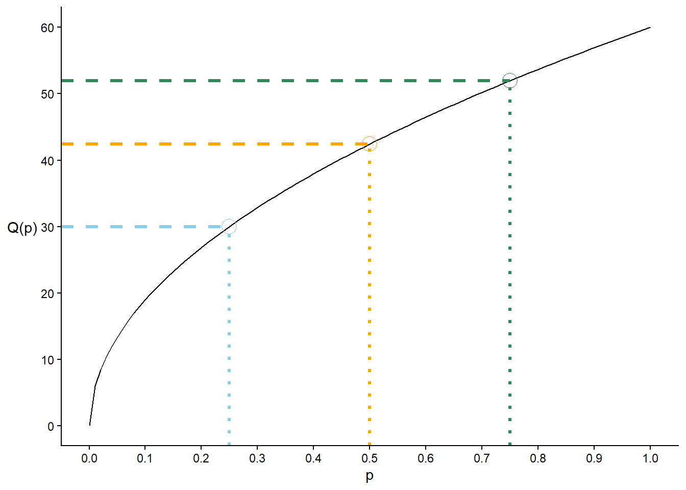
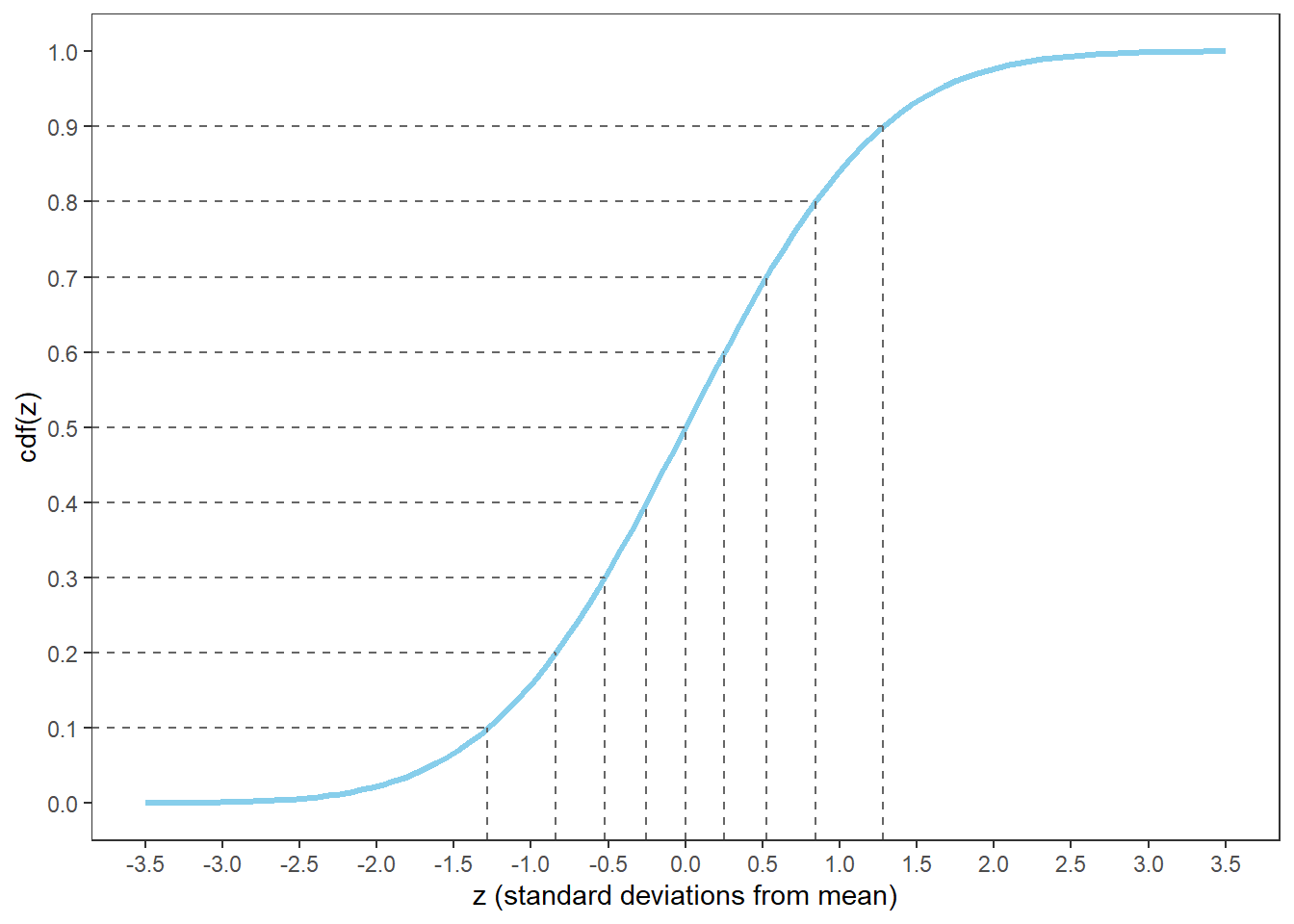
Definition 5.2 For a continuous random variable \(X\) with cdf \(F\), the quantile function\(Q:[0,1]\mapsto\mathbb{R}\) is the inverse8 of the cdf: \(Q(p) = F^{-1}(p)\).
Both the cdf and the quantile function fully specify a distribution by providing all its percentiles. The only difference is the “direction” from input to output.
The cdf fills in the following blank for any given \(x\): \(x\) is the (blank) percentile.
The quantile function fills in the following blank for a given \(p\): the \(p\)th percentile is (blank).
See Figure 5.14 (b) for a plot of the quantile function for Example 5.8. Given any percent \(p\) (as a decimal) on the horizontal axis, we can read off the value of the corresponding percentile from the quantile function, e.g., the 25th percentile is 30, the 50th percentile is 42.42, and the 75th percentile is 51.96.
Both the cdf or quantile function can be used to create a spinner for a distribution. In Example 5.8, if we want to place the values 10, 20, 30, 40, 50 on the spinner axis, we can plug them into the cdf to find the corresponding percentiles; see Figure 5.11 (b). If we want to mark the 8.33th, 16.67th, 25th, \(\ldots\) percentiles—at the “1 o’clock”, “2 o’clock”, “3 o’clock”, \(\ldots\) positions—we plug 1/12, 2/12, 3/12, \(\ldots\) into the quantile function; see Figure 5.11 (a).
(a) cdf
(b) quantile function
Figure 5.14: cdf and quantile function for Example 5.7
You can think of a cdf or a quantile function as just a really long list of percentiles like in Table 5.1.
Example 5.9 Let \(X\) be a continuous random variable whose distribution is partially summarized by Table 5.1.
Let \(F\) be the cdf of \(X\). Evaluate and interpret \(F(42.8)\).
Let \(Q\) be the quantile function of \(X\). Evaluate and interpret \(Q(0.9)\).
Solution (click to expand)
Solution 5.9.
\(F(42.8)=\text{P}(X \le 42.8) = 0.3\), since 42.8 is the 30th percentile. For the cdf we find 42.8 in the value column and read off the percentile (0.3 for 30th).
\(Q(0.9) = 276.3\), since the 90th percentile is 276.3. For the quantile function we find 0.9 (90th) in the percentile column and read off the value.
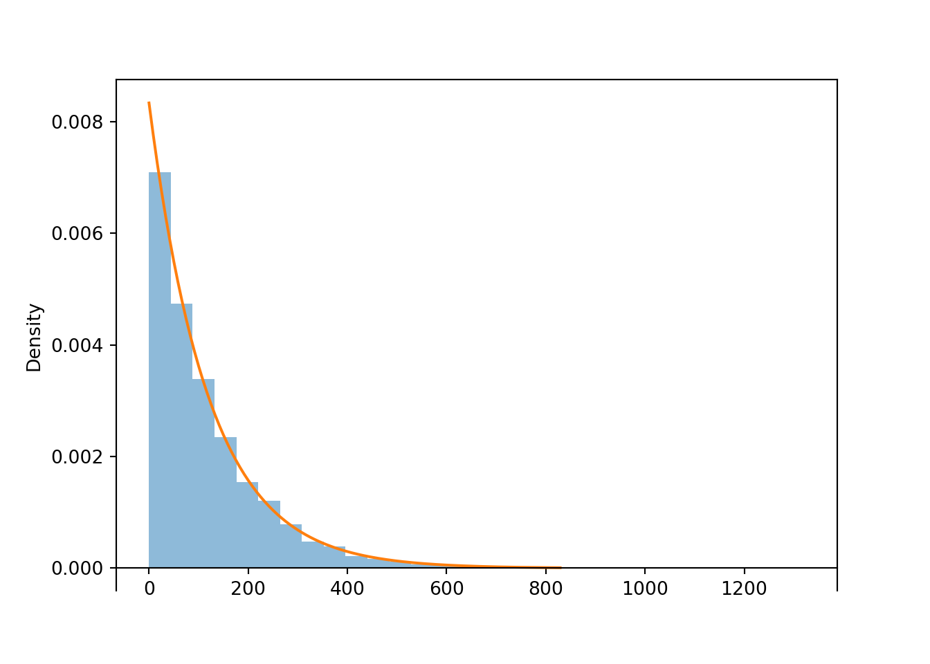
We can use simulation to approximate the cdf of a random a variable. For example, suppose \(X\) has a Normal(30, 10) distribution and consider Table 5.2 which displays ten simulated values, sorted from smallest to largest. For any \(x\) we can approximate the cdf \(F(x) = \textrm{P}(X\le x)\) with \(\widehat{F}(x)\), the proportion of simulated values that are less than or equal to \(x\). \[
\widehat{F}(x) = \text{Proportion of simulated values }\le x
\] For example, since 3 of the simulated values are less than 20, we can approximate \(F(20) = \textrm{P}(X\le 20)\) as \(\widehat{F}(20) = 3/10=0.3\). Note that we can approximate \(F(x)\) for all values \(x\), not simply the simulated values.
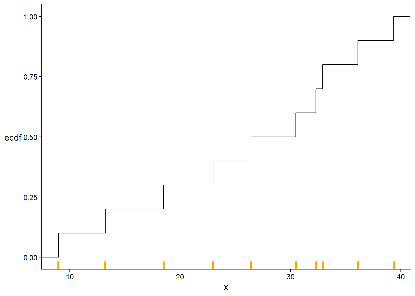
Table 5.2: Ten values simulated from a Normal(30, 10) distribution, sorted from smallest to largest,
Repetition (sorted)
Simulated value x
Proportion of simulated values <= x
1
8.96596
0.1
2
13.22942
0.2
3
18.51603
0.3
4
22.97933
0.4
5
26.42008
0.5
6
30.48253
0.6
7
32.30427
0.7
8
32.92961
0.8
9
36.11465
0.9
10
39.34921
1.0
The function \(\widehat{F}\) is called the empirical cumulative distribution function (ecdf). The ecdf is a step function9 which jumps up at each of the observed simulated values and is flat in between. See Figure 5.15 for the ecdf of the values in Table 5.2.
Figure 5.15: Empirical distribution function of the 10 values in Table 5.2. The simulated values are marked in orange along the variable axis; the ecdf jumps by 1/10 at each simulated value and is flat in between.
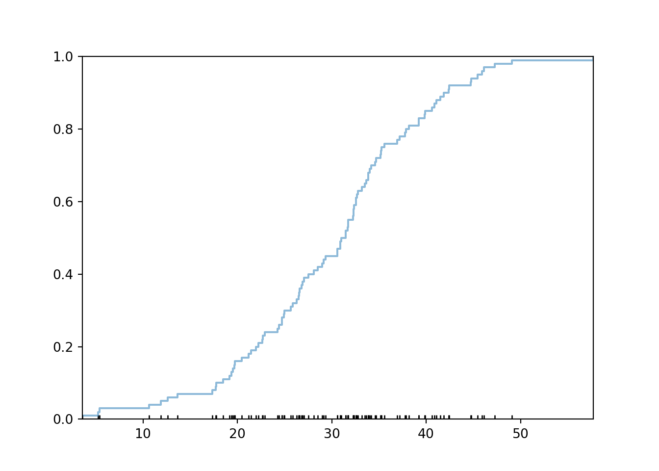
Here is some Symbulate code to plot the ecdf of simulated values (along with a rug plot).
X = RV(Normal(30, 10))x = X.sim(100)plt.figure()x.plot(['ecdf', 'rug']) # empirical cdf and rug plot of simulated valuesplt.show()
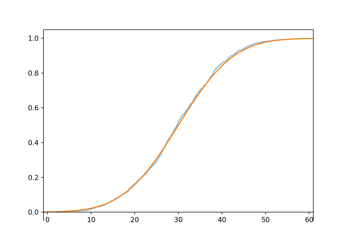
As we simulate more values, the ecdf becomes “more continuous”. The ecdf of 1000 simulated values is pretty close10 to the theoretical Normal(30, 10) cdf.
<symbulate.distributions.Normal object at 0x0000026400BFD7F0>
plt.show()
5.6 One ring spinner to rule them all
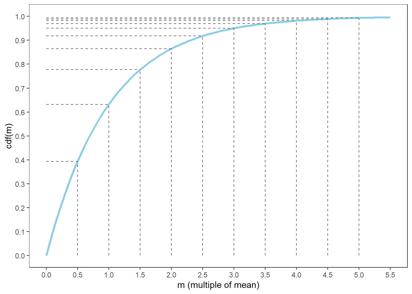
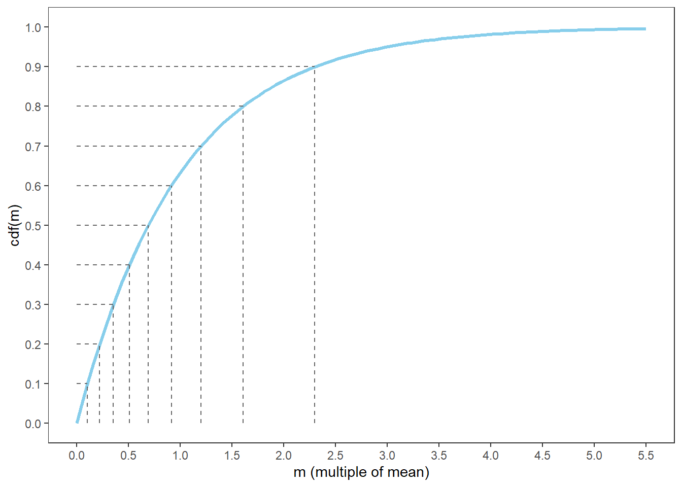
We have constructed many different spinners to represent a variety of distributions. All spinners shared a common assumption: when spun, the infinitely precise needle pointed uniformly at random to a value on the spinner axis. We modeled different distributions simply by relabeling the values on the axis: by appropriately stretching/shrinking the values on the axis corresponding to intervals of larger/smaller probability we can represent the percentiles of any distribution.
The foundation of all spinners is the Uniform(0, 1) spinner, reproduced in Figure 5.16.
Figure 5.16
For a Uniform(0, 1) distribution, percents and percentiles are equivalent: the value \(x\) is the \(x\)th percentile; the \(p\)th percentile is \(p\). For a Uniform(0, 1) distribution the cdf \(F\) and quantile function \(Q\) are the same and equal to the identity function (over the [0, 1] range of possible values): if \(X\) has a Uniform(0, 1) distribution, \(F(x) = x, 0<x<1\) and \(Q(p) = p, 0<p<1\). For example, for a Uniform(0, 1) distribution 25% of values are less than 0.25. Because of this, we can simulate a value from any marginal distribution starting with a spin of the Uniform(0, 1) spinner; we don’t actually have to create a new spinner.
For example, suppose we want to simulate a value of \(X\) from Example 5.7 and Example 5.8. Suppose we spin the Uniform(0, 1) spinner and get \(u=0.25\), which is the 25th percentile of the Uniform(0, 1) distribution. Then we set \(x = 30\) minutes after noon, because \(30=60\sqrt{0.5}\) is the 25th percentile of \(X\). We can simulate values of \(X\) using this general process:
Spin the Uniform(0, 1) spinner to get \(u\), which indicates what percentile the simulated value should be (e.g., \(u=0.25\) for the 25th percentile)
Set \(x = 60\sqrt{u}\) to find the corresponding value of the percentile in the scale of \(X\) (e.q., \(x = 60\sqrt{0.25} = 30\) minutes after noon is the 25th percentile).
In the long run, 25% of simulated values of \(U\) will be less than 0.25, so 25% of simulated values of \(X\) will be less than 30. That is, 30 will correctly correspond to the 25th percentile of \(X\).
The simulation below carries out this process. Compare the results to the examples in Section 5.5; the simulated distribution of \(X\) has all the appropriate properties (approximately).
U = RV(Uniform(0, 1))X =60* sqrt(U)(U & X).sim(10)
Theorem 5.1 (Universality of the Uniform (“one spinner to rule them all”)) To simulate a value of a random variable \(X\) with quantile function \(Q\):
Spin the Uniform(0, 1) spinner to get \(u\), which indicates what percentile the simulated value should be
Set \(x = Q(u)\) to find the corresponding value of the percentile in the scale of the variable
Universality of the Uniform11 might look complicated but all it basically says is that we can construct a spinner for any marginal distribution by putting the 25th percentile 25% of the way around, the 75th percentile 75% of the way around, etc. Actually, universality of the Uniform says we don’t have to create a new spinner: we can just spin the Uniform(0, 1) spinner and plug the resulting value into the quantile function of \(X\). Remember that we can think of a cdf or a quantile function of \(X\) as just a really long list of percentiles like in Table 5.1. So we can basically just simulate a value from Uniform(0, 1) to determine the percentile and then look up the value of \(X\) from the list (using the quantile function instead of the cdf because we’re going in the direction “percent to value”).
Universality of the Uniform is more useful for continuous random variables, but it works for discrete random variables too (though the definition of the quantile function is more complicated). For example, to obtain the discrete spinner in Figure 2.9 (b) corresponding to a weighted four-sided die, start with the Uniform(0, 1) spinner and map
The range (0, 0.1] to 1,
The range (0.1, 0.3] to 2,
The range (0.3, 0.6] to 3,
The range (0.6, 1] to 4
Then the probability that the Uniform(0, 1) spinner lands in the range (0.3, 0.6] is 0.3, so the spinner resulting from this mapping would return a value of 3 with probability 0.3. (The probability of the infinitely precise needle landing on a specific value like 0.3 (that is, \(0.300000000\ldots\)) is 0, so it doesn’t really matter what we do with the endpoints of the intervals.)
5.7 Probability density functions
A marginal distribution of a random variable is a description of its possible values and their relative likelihoods. For a discrete random variable \(X\), we often describe its marginal distribution via the probability mass function (pmf) \(p_X\) which specify the probability of each possible value of \(X\): \(p_X(x)= \textrm{P}(X = x)\). The continuous analog of a probability mass function (pmf) is a probability density function (pdf). However, while pmfs and pdfs play analogous roles, they are different in one fundamental way; namely, a pmf outputs probabilities directly, while a pdf does not. Remember that for a continuous random variable \(X\), \(\textrm{P}(X = x) = 0\) for any \(x\), so “equal to” probabilities don’t make sense (like they did for discrete random variables). Rather, the probability density function of a continuous random variable \(X\) determines the probability that \(X\) takes a value in any interval.
Definition 5.3 The probability density function (pdf) of a continuous RV \(X\), defined on a probability space with probability measure \(\textrm{P}\), is a function \(f_X:\mathbb{R}\mapsto[0,\infty)\) which satisfies:
\[
\textrm{P}(a < X < b) = \text{Area under the pdf } f_X \text{ over the region } (a, b)
\]
The axioms of probability imply that any pdf \(f\) can’t be negative (\(f(x)\ge 0\) for all \(x\)), since otherwise the density could yield negative probabilities. Also, the total area under the pdf must be 1 to account for 100% probability.
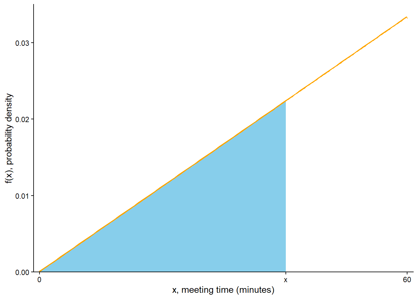
Recall Figure 5.12 and Figure 5.17. Based on these plots, sketch a probability density function for \(X\).
Based on the previous part, it seems reasonable to assume that the pdf \(f_X\) is linear as a function of possible \(x\) values, with an intercept of 0 and positive slope; that is, \[
f_X(x) =
\begin{cases}
cx, & 0<x<60,\\
0 & \text{otherwise.}
\end{cases}
\] Compute the value of \(c\). Note: this involves more than just reading off a value from a plot. What is the key principle that will determine the value of \(c\)?
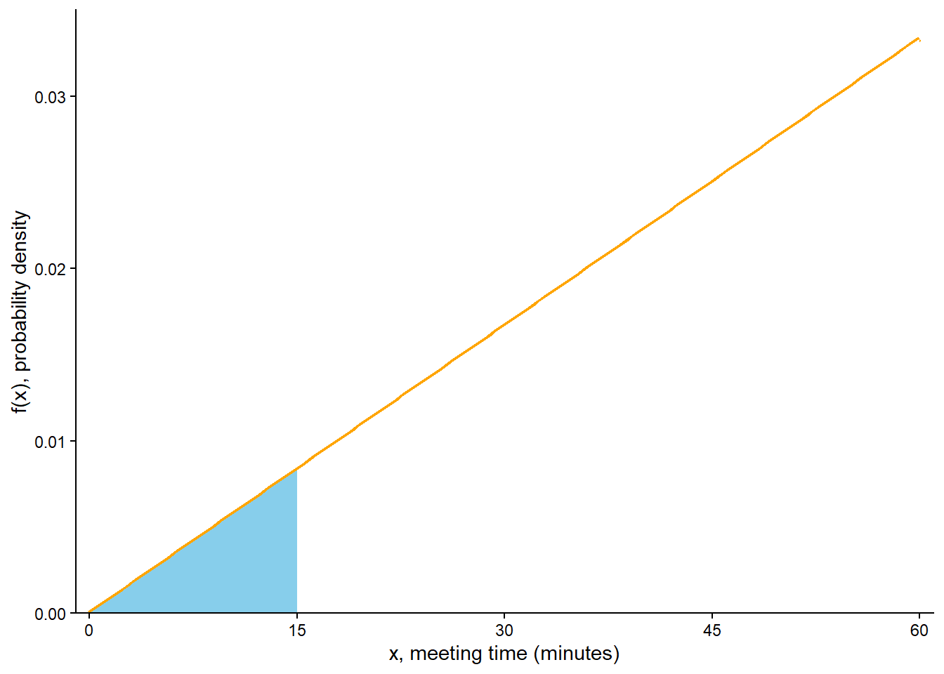
Use the pdf (and geometry) to compute \(\textrm{P}(X < 15)\). (Compare to part 1 of Example 2.33.)
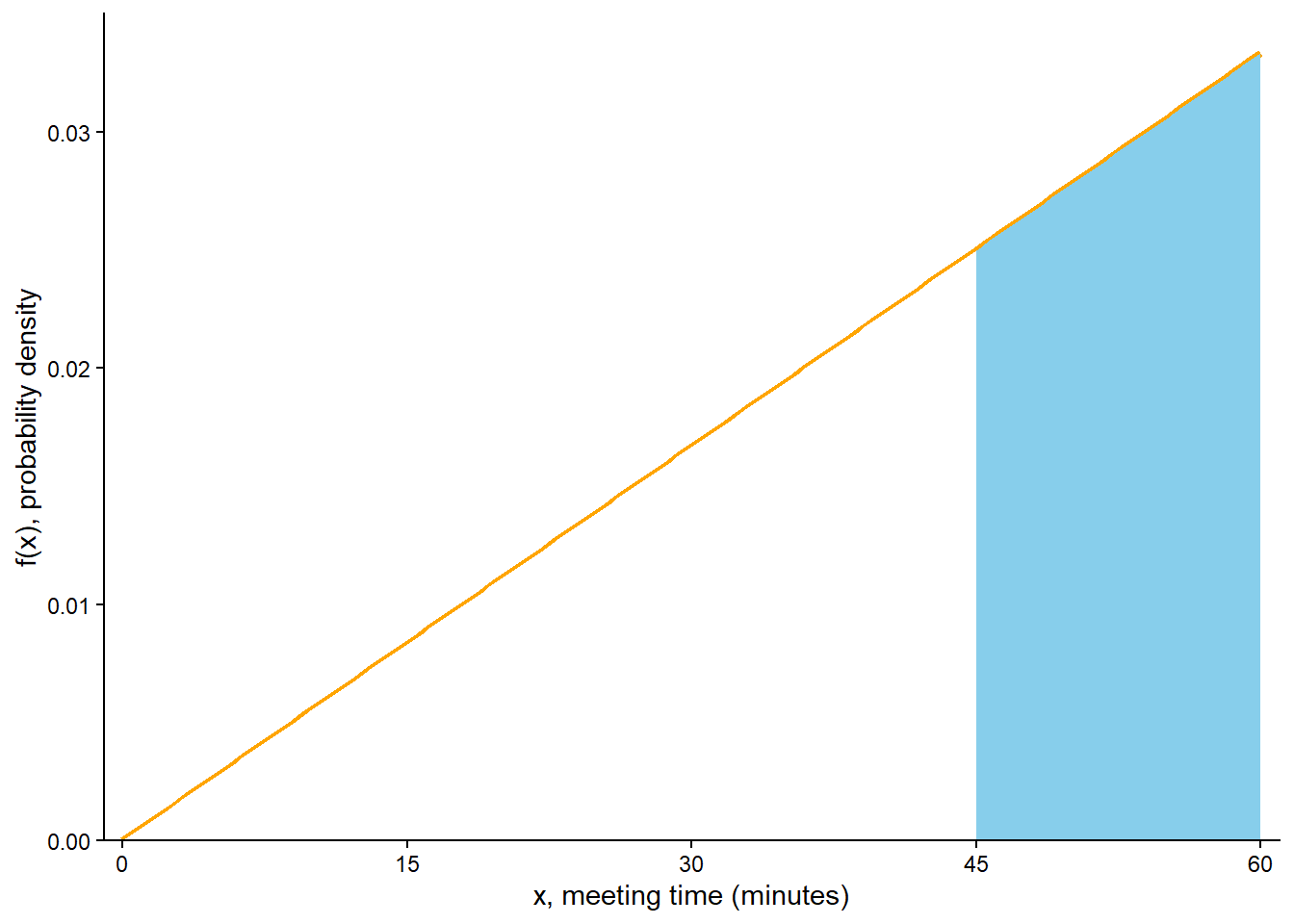
Use the pdf (and geometry) to compute \(\textrm{P}(X > 45)\). (Compare to part 3 of Example 2.33.)
Use the pdf (and geometry) to find an expression for the cdf of \(X\). (Compare to the cdf from Example 5.7.)
Solution (click to expand)
Solution 5.10.
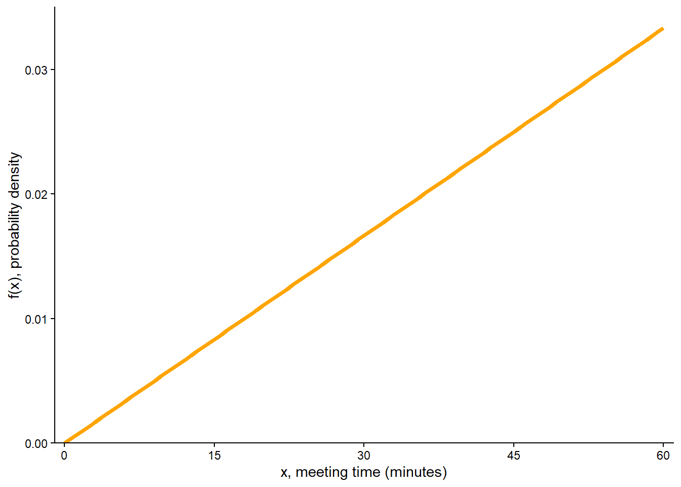
From the previous plots, it seems that the pdf is lowest at 0, highest at 60, and increases linearly. We can sketch this general shape like in Figure 5.18 (a) but without the values on the vertical density axis yet. The general form of the pdf is linear with positive slope, say \(c\), and an intercept of 0. That is, the pdf has general form \(f_X(x) = cx, 0<x<60\). The possible values are [0, 60], so the pdf is 0 outside this interval.
Since the area under the curve represents probability, we need the total area under the pdf over the range of possible values to be 1 (for 100% probability). The total area is the area of a triangle with base (60-0) and height equal to the density at 60, \(f(60) = 60c\). This area is \((1/2)(60 -0)(60c)\), which we set equal to 1 and solve to get \(c = 2/3600\). That is, \(f(x) = (2/3600)x, 0 < x < 60\). See the vertical axis on Figure 5.18 (a); the height at \(x=60\) is \(f(60) = (2/3600)(60) = 1/ 30 \approx 0.033\).
See Figure 5.18 (b). The area under the pdf over the interval [0, 15] is a triangle with base (15-0) and height equal to the density at 15, \(f(15) = (2/3600)(15)\). This area is \((1/2)(15 -0)(2/3600)(15) = 0.0625\). (This is the same value as in part 1 of Example 2.33.)
See Figure 5.18 (c). It’s easier to first compute \(\textrm{P}(X < 45)\), represented by the unshaded area in Figure 5.18 (c). The area under the pdf over the interval [0, 45] is a triangle with base (45-0) and height equal to the density at 15, \(f(45) = (2/3600)(45)\). This area is \((1/2)(45 -0)(2/3600)(45) = 0.5625\). So \(\textrm{P}(X > 45) = 1 - \textrm{P}(X < 45) = 1 - 0.5625 = 0.4375\).
(This is the same value as in part 3 of Example 2.33.)
The calculation is similar to the previous parts but with values like 15 and 45 replaced by a generic \(x\) between 0 and 60. See Figure 5.18 (d), where the shaded area represents \(F_X(x) = \textrm{P}(X \le x)\). The area under the pdf over the interval \([0, x]\) is a triangle with base \((x-0)\) and height equal to the density at \(x\), \(f(x) = (2/3600)x\). This area is \((1/2)(x -0)(2/3600)(x) = x^2/3600 = (x/60)^2\). Therefore, the cdf of \(X\) if \(F_x(x) = (x/60)^2, 0<x<60\). (This is the same cdf as in Example 5.7.)
(a) Shaded area represents \(\textrm{P}(X > 45)\)
(b) For a generic \(x\) between 0 and 60, the shaded area represents \(F_X(x) = \textrm{P}(X \le x)\), where \(F_X\) is the cdf of \(X\)
The “compute \(c\)” part of Example 5.10 is a continuous analog of normalizing. We specify the general shape of the pdf (e.g., linear, \(cx\) for \(0<x<60\)), then scale the density axis so that the total area under the density curve equal to 1. In general, a pdf is often defined only up to some multiplicative constant \(c\), for example \(f_X(x) = c\times(\text{some function of x})\), or \(f_X(x) \propto \text{some function of x}\). The constant \(c\) does not affect the shape of the distribution as a function of \(x\), only the scale on the density axis. The absolute scaling on the density axis is somewhat irrelevant; it is whatever it needs to be to provide the proper area of 1. What’s important is the relative heights of the density at different \(x\) values.
Example 5.11 Continuing Example 5.10. Han’s meeting time \(X\) (minutes after noon) has pdf \[
f_X(x) =
\begin{cases}
(2/3600)x, & 0<x<60,\\
0 & \text{otherwise.}
\end{cases}
\] The corresponding cdf satisfies \(F_X(x) = (x/60)^2, 0<x<60\).
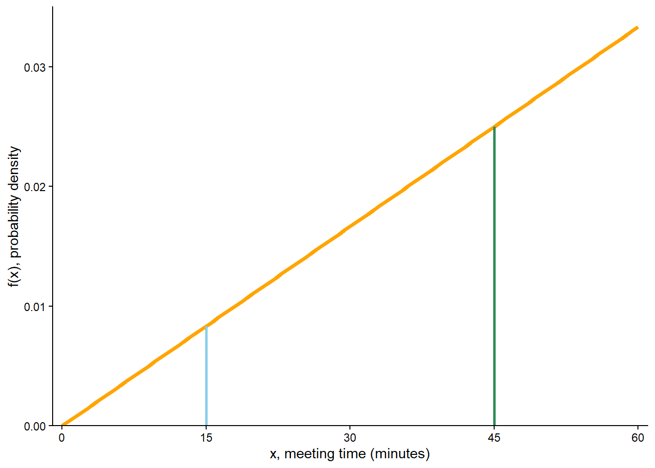
Compute the probability that \(X\), truncated12 to the nearest minute, is 15 minutes after noon; that is, compute \(\textrm{P}(15 \le X<16)\). How does this probability compare to \(f(15)\)?
Compute the probability that \(X\), truncated to the nearest minute, is 45 minutes after noon; that is, compute \(\textrm{P}(45 \le X<46)\). How does this probability compare to \(f(45)\)?
Compute and interpret the ratio of the probabilities from the two previous parts. How does this ratio compare to \(f(45)/f(15)\)?
Compute the probability that \(X\), truncated to the nearest second, is 15 minutes after noon; that is, compute \(\textrm{P}(15 \le X<15+1/60)\). How does this probability compare to \(f(15)\)? Hint: try \(f(15)(1/60)\).
Compute the probability that \(X\), truncated to the nearest second, is 45 minutes after noon; that is, compute \(\textrm{P}(45 \le X<45+1/60)\). How does this probability compare to \(f(45)\)? Hint: try \(f(45)(1/60)\).
Compute and interpret the ratio of the probabilities from the two previous parts. How does this ratio compare to \(f(45)/f(15)\)?
Without actually computing probabilities, approximate the probability than Han arrives within one millisecond (1/60000 minutes) of 12:15.
Without actually computing probabilities, approximate the probability than Han arrives within one millisecond (1/60000 minutes) of 12:45.
Without actually computing probabilities, approximately how much more likely is it for Han to arrive within one millisecond of 12:45 than within one millisecond of 12:15?
How is \(f(x)\) related to the probability that \(X\) is “close to” \(x\)?
Solution (click to expand)
Solution 5.11.
\(\textrm{P}(15 \le X<16) = F_X(16) - F_X(15) = (16/60)^2 - (15/60)^2 = 0.00861\), which is fairly close to \(f(15) = (2/3600)(15) = 0.00833\). This probability is represented by the blue shaded area in Figure 5.19 (a).
With a little algebra we can write \((16/60)^2 - (15/60)^2 = ((15+1)/60)^2 - (15/60)^2 = (2/3600)(15) + 1/3600 = f(15) + 1/3600\approx f(15)\). This approximate probability is represented by the blue shaded area in Figure 5.19 (b). The approximation is fairly accurate since \(1/3600 = 0.000278\) is much smaller (30 times smaller) than \((2/3600)(15)=0.00833\).
\(\textrm{P}(45 \le X<46) = F_X(46) - F_X(45) = (46/60)^2 - (45/60)^2 = 0.02528\), which is fairly close to \(f(45) = (2/3600)(45) = 0.02500\). This probability is represented by the green shaded area in Figure 5.19 (a).
With a little algebra we can write \((46/60)^2 - (45/60)^2 = ((45+1)/60)^2 - (45/60)^2 = (2/3600)(45) + 1/3600 = f(45) + 1/3600\approx f(45)\). This approximate probability is represented by the green shaded area in Figure 5.19 (b).
It is 2.9355 times more likely for Han to arrive within 1 minute after 12:45 than within 1 minute after 12:15. \[
\frac{\textrm{P}(45 \le X<46)}{\textrm{P}(15 \le X<16)} = \frac{0.02528}{0.00861} = 2.9355
\] This ratio is represented by the ratio of green and blue shaded areas in Figure 5.19 (a).
Using the approximations from the previous parts, \[
\frac{\textrm{P}(45 \le X<46)}{\textrm{P}(15 \le X<16)} = \frac{f(45) + 1/3600}{f(15) + 1/3600} \approx \frac{f(45)}{f(15)} = \frac{(2/3600(45))}{(2/3600)(15)} = \frac{45}{15} = 3
\] It is approximately 3 times more likely for Han to arrive within 1 minute after 12:45 than within 1 minute after 12:15. This ratio is represented by the ratio of green and blue heights in Figure 5.19 (c).
\(\textrm{P}(15 \le X<15 + 1/60) = F_X(15+1/60) - F_X(15) = ((15+1/60)/60)^2 - (15/60)^2 = 0.00013897\), which is fairly close to \(f(15)(1/60) = (2/3600)(15)(1/60) = 0.00013889\). With a little algebra we can write \(((15+1)/60)^2 - (15/60)^2 = (2/3600)(15)(1/60) + 1/3600^2 = f(15)(1/60) + 1/3600^2\approx f(15)(1/60)\). The approximation is since \(1/3600^2 = 0.00000008\) is much smaller than \((2/3600)(15)(1/60)=0.000139\).
\(\textrm{P}(45 \le X<45 + 1/60) = F_X(45+1/60) - F_X(45) = ((45+1/60)/60)^2 - (45/60)^2 = 0.00041674\), which is fairly close to \(f(45)(1/60) = (2/3600)(45)(1/60) = 0.00041667\). With a little algebra we can write \(((45+1)/60)^2 - (45/60)^2 = (2/3600)(45)(1/60) + 1/3600^2 = f(45)(1/60) + 1/3600^2\approx f(45)(1/60)\). The approximation is fairly accurate since \(1/3600^2 = 0.00000008\) is much smaller than \((2/3600)(45)(1/60)=0.000417\).
It is 2.99889 times more likely for Han to arrive within 1 second after 12:45 than within 1 second after 12:15. \[
\frac{\textrm{P}(45\le X<45+1/60)}{\textrm{P}(15 \le X<15+1/60)} = \frac{0.00041667}{0.00013889} = 2.99889
\] Using the approximations from the previous parts, \[
\frac{\textrm{P}(45 \le X<45+1/60)}{\textrm{P}(15 \le X<15+1/60)} = \frac{f(45)(1/60) + 1/3600^2}{f(15)(1/60) + 1/3600^2} \approx \frac{f(45)(1/60)}{f(15)(1/60)} = \frac{f(45)}{f(15)}= \frac{(2/3600(45))}{(2/3600)(15)} = \frac{45}{15} = 3
\] It is approximately 3 times more likely for Han to arrive within 1 second after 12:45 than within 1 second after 12:15. This ratio is represented by the ratio of green and blue heights in Figure 5.19 (c).
The previous parts suggest that the probability of arriving within one minute of 12:15 is approximately \(f(15)(1)\) and the probability of arriving within one second (1/60 minutes) of 12:15 is approximately \(f(15)(1/60)\), so it seems reasonable that the probability of arriving within one millisecond (1/60000 minutes) of 12:15 is approximately \(f(15)(1/60000) = (2/3600)(15)(1/6000) = 0.0000001388889\). (This is essentially the same value we get when we actually compute \(\textrm{P}(15 < X < 15 + 1/60000)\).)
The previous parts suggest that the probability of arriving within one minute of 12:45 is approximately \(f(45)(1)\) and the probability of arriving within one second (1/60 minutes) of 12:45 is approximately \(f(45)(1/60)\), so it seems reasonable that the probability of arriving within one millisecond (1/60000 minutes) of 12:45 is approximately \(f(45)(1/60000) = (2/3600)(45)(1/6000) = 0.0000004166667\). (This is essentially the same value we get when we actually compute \(\textrm{P}(15 < X < 15 + 1/60000)\).)
The previous parts suggest that the ratio of the probabilities is approximately \[
\frac{f(45)(1/60000)}{f(15)(1/60000)} = \frac{f(45)}{f(15)}= \frac{(2/3600(45))}{(2/3600)(15)} = \frac{45}{15} = 3
\] It is approximately 3 times more likely for Han to arrive within 1 millisecond after 12:45 than within 1 millisecond after 12:15. This ratio is represented by the ratio of green and blue heights in Figure 5.19 (c).
See discussion below.
(a) Shaded areas represent exact probabilities \(\textrm{P}(15<X<16)\) and \(\textrm{P}(45<X<46)\)
(b) Shaded areas represent approximate probabilities \(\textrm{P}(15<X<16)\approx f(15)(1)\) and \(\textrm{P}(45<X<46)\approx f(45)(1)\)
Be careful: density is not probability! If a continuous random variable \(X\) has pdf \(f_X\), \(f_X(x)\) by itself does not provide the probability of anything. However, Example 5.11 illustrates that \(f_X(x)\) is related to the probability that \(X\) is “close to” \(x\).
For example, suppose we’re interested in the probability that Han arrives close to 12:15. If “close to” is defined as “within 1 minute after 12:15”, this probability is represented by the shaded blue area in Figure 5.19 (a); we showed that this probability is equal to \(f(15) + 1/3600\). The blue area is a trapezoid, which we can think of as the area of a tall rectangle with base 1 and height \(f(15)\) plus the area of the tiny triangle on top (which is pretty hard to see and has area 1/3600). If we ignore the tiny triangle, we can approximate the probability by the area of the rectangle, \(f(15)(1)\); this area is represented by the shaded blue area in Figure 5.19 (b), which is virtually identical to the one in Figure 5.19 (a). Similarly we can approximate the probability that Han arrives within 1 minute after 12:45 (represented by the shaded green area in Figure 5.19 (a)) as \(f(45)(1)\) (represented by the shaded green area in Figure 5.19 (a)).
If “close to” 12:15 is defined as “within 1 second (1/60 minute) after 12:15”, we could approximate the area under the pdf which defines the probability as the area of a rectangle with base \(1/60\) and height \(f(45)\); the probability is approximately \(f(15)(1/60)\). If “close to” 12:15 is defined as “within 1 millisecond (1/60000 minute) after 12:15”, we could approximate the area under the pdf which defines the probability as the area of a rectangle with base \(1/60000\) and height \(f(45)\); the probability is approximately \(f(15)(1/60000)\). In general, we can approximate the probability that \(X\) is close to 15 as the product of \(f(15)\) and what counts as “close to” in the measurement units of the variable (e.g., 1 minute, 1/60 minute, 1/60000 minute).
The following result states the general principle. When we think of “close to”, we usually think of rounding as opposed to truncating (as in Example 5.11), so the following lemma is stated with rounding in mind. In Example 5.11, the probability that \(X\) (minutes) rounded to the nearest minute is \(\textrm{P}(14.5<X<15.5) = \textrm{P}(15 - 0.5(1)<X<15 + 0.5(1)\), the probability that \(X\) rounded to the nearest second (1/60 minute) is \(\textrm{P}(15 - 0.5(1/60)<X<15 + 0.5(1/60))\), and , the probability that \(X\) rounded to the nearest millisecond (1/60000 minute) is \(\textrm{P}(15 - 0.5(1/60000)<X<15 + 0.5(1/60000))\).
Lemma 5.1 Suppose that \(X\) is a continuous random variable with pdf \(f_X\). For a possible value \(x\), the height of the pdf \(f_X(x)\) is related to \(\textrm{P}(X \text{ is close to } x)\) in the following sense. Let \(\epsilon\) be a small number in the measurement units of \(X\). Then \[
\textrm{P}(x - 0.5\epsilon < X< x + 0.5\epsilon) \approx f_X(x)\epsilon
\]
In Lemma 5.1\(\epsilon\) represents what counts as “close to” in the measurement units of the variable. In Example 5.11, \(\epsilon=1\) represents rounding to the nearest minute, \(\epsilon=1/60\) minute represents rounding to the nearest second, and \(\epsilon=1/60000\) minute represents rounding to the nearest millisecond. In general, \(\epsilon = 1\) represents rounding to the nearest measurement unit, \(\epsilon = 0.1\) represents rounding to one decimal place, \(\epsilon = 0.01\) represents rounding to one decimal places, etc. Note that what counts as “small” depends on the measurement units and context. If \(U\) has a Uniform(0, 1) distribution then all the possible values range from 0 to 1, so \(\epsilon=1\) would not be considered small in this case. On the other hand, if \(X\) represents annual household income measured in US dollars, ranging over hundreds of thousands, then \(\epsilon=1000\) US dollars would be reasonably small and would represent “close to” as rounding to the nearest 1000 US dollars.
For a continuous random variable \(X\) any particular \(x\) has probability 0, so technically it doesn’t make sense to say that some values are more likely than others in the “equal to” sense. However, \(X\) is more likely to take values close to those \(x\) values that have greater density.
In Example 5.11, \(X\) is approximately \(\frac{f(45)}{f(15)} = 3\) times more likely to be close to 45 than 15, regardless of how “close to” is defined.
The relative heights of a pdf provide information about the relative likelihoods of possible values in the “close to” sense.
Lemma 5.2 Suppose that \(X\) is a continuous random variable with pdf \(f_X\). For any two possible values \(x_1\) and \(x_2\)\[
\frac{\textrm{P}(X \text{ is close to } x_1)}{\textrm{P}(X \text{ is close to } x_2)} \approx \frac{f_X(x_1)}{f_X(x_2)}
\] regardless of how “close to” is defined.
For example, if \(f_X(x_1) = 2f_X(x_2)\) then \(X\) is approximately 2 times more likely to be close to \(x_1\) than to \(x_2\).
5.8 Expected values
Example 5.12 Continuing Example 5.10. Han’s arrival time \(X\) (minutes after noon) has pdf \[
f_X(x) =
\begin{cases}
(2/3600)x, & 0<x<60,\\
0 & \text{otherwise.}
\end{cases}
\]
Explain how you could use simulation to approximate \(\textrm{E}(X)\). Then conduct a simulation and approximate \(\textrm{E}(X)\).
Explain how you could approximate \(\textrm{E}(X)\) as a sum (as if \(X\) were a discrete random variable).
How could you obtain a better approximation than the sum in the previous part?
It can be shown that \(\textrm{E}(X) = 40\) minutes. Compare to the approximations. Then interpret \(\textrm{E}(X)\) in context.
Compute and interpret \(\textrm{P}(X \le \textrm{E}(X))\). Is it 0.5? Explain.
Solution (click to expand)
Solution 5.12.
As usual, we can simulate many values of \(X\) and average them. For example, if we simulate 10000 values of \(X\) we would sum the 10000 values and divide by 10000. We can simulate values of \(X\) using a spinner like in Figure 5.11, via the method in Section 5.6. See Symbulate code below. Simulation results suggest \(\textrm{E}(X)\) is about 40 minutes.
Any value in [0, 60] is possible, but we can obtain an approximation by truncating (or rounding) to the nearest minute. We’ll truncate to be consistent with Example 5.11. The probability that \(X\) truncated to the nearest minute is \(x\) is approximately \((1)f(x) = (2/3600)x\); see Example 5.11 for examples. Therefore, we can treat \(X\) like it’s a discrete random variable which takes value \(x = 0, 1, 2, 3, \ldots, 57, 58, 59\) with probability \((2/3600)x\). Then we can compute the expected value of this discrete random variable in the usual way as a probability-weighted average value. \[
{\scriptsize
(0)((2/3600)0) + (1)((2/3600)1) + (2)((2/3600)2) + (3)((2/3600)3) + \cdots + (57)((2/3600)57) + (58)((2/3600)58)+ (59)((2/3600)59)
}
\] There are 60 terms in the sum, so use software (see below) or a spreadsheet to compute, arriving at an approximation13 of 39 minutes.
\(X\) is a continuous random variable but in the previous part we treated it as if were discrete, thus losing some information. The “more continuous” our discrete approximation is, the better it is should be. Thus, we can get a better approximation by truncating (or rounding) to the nearest second.
The probability that \(X\) truncated to the nearest second—that is, 1/60 minute—is \(x\) is approximately \((1/60)f(x) = (1/60)(2/3600)x\). Therefore, we can treat \(X\) like it’s a discrete random variable which takes values, in minutes, \(x = 0, \frac{1}{60}, \frac{2}{60}, \frac{3}{60}, \ldots, 59\frac{57}{60}, 59\frac{58}{60}, 59\frac{59}{60}\) with probability \((1/60)(2/3600)x\); see Example 5.11 for examples. Then we can compute the expected value of this discrete random variable in the usual way as a probability-weighted average value. \[
{\scriptsize
(0)((1/60)(2/3600)0) + (1/60)((1/60)((2/3600)(1/60))) + (2/60)((1/60)((2/3600)(2/60))) + (3/60)((1/60)((2/3600)(3/60))) + \cdots
}
\] Now there are 3600 terms in the sum, one for each second between 0 and 60 minutes, so we use software (see below) or a spreadsheet to compute, arriving at an approximation of 39.98 minutes.
The simulation yields an approximate expected value close to 40 minutes. The nearest-minute discretion approximate yields a reasonably close value (39), and the nearest-second discrete approximation is even closer (39.98). If we imagine Han’s arrive times over many days follow this pattern, we expect him to arrive 40 minutes after noon on average per day.
We have already seen that the cdf is \(F(x) = (x/60)^2\), so \[
\textrm{P}(X \le \textrm{E}(X)) = \textrm{P}(X \le 40) = F(40) = (40/60)^2 = 4/9 = 0.444
\] On 44.4% of days Han’s arrival time is below average. This is not 0.5 because Han is more likely to arrive late than early. The mean is not necessarily the median.
Here is a simulation of \(X\) values for Example 5.10.
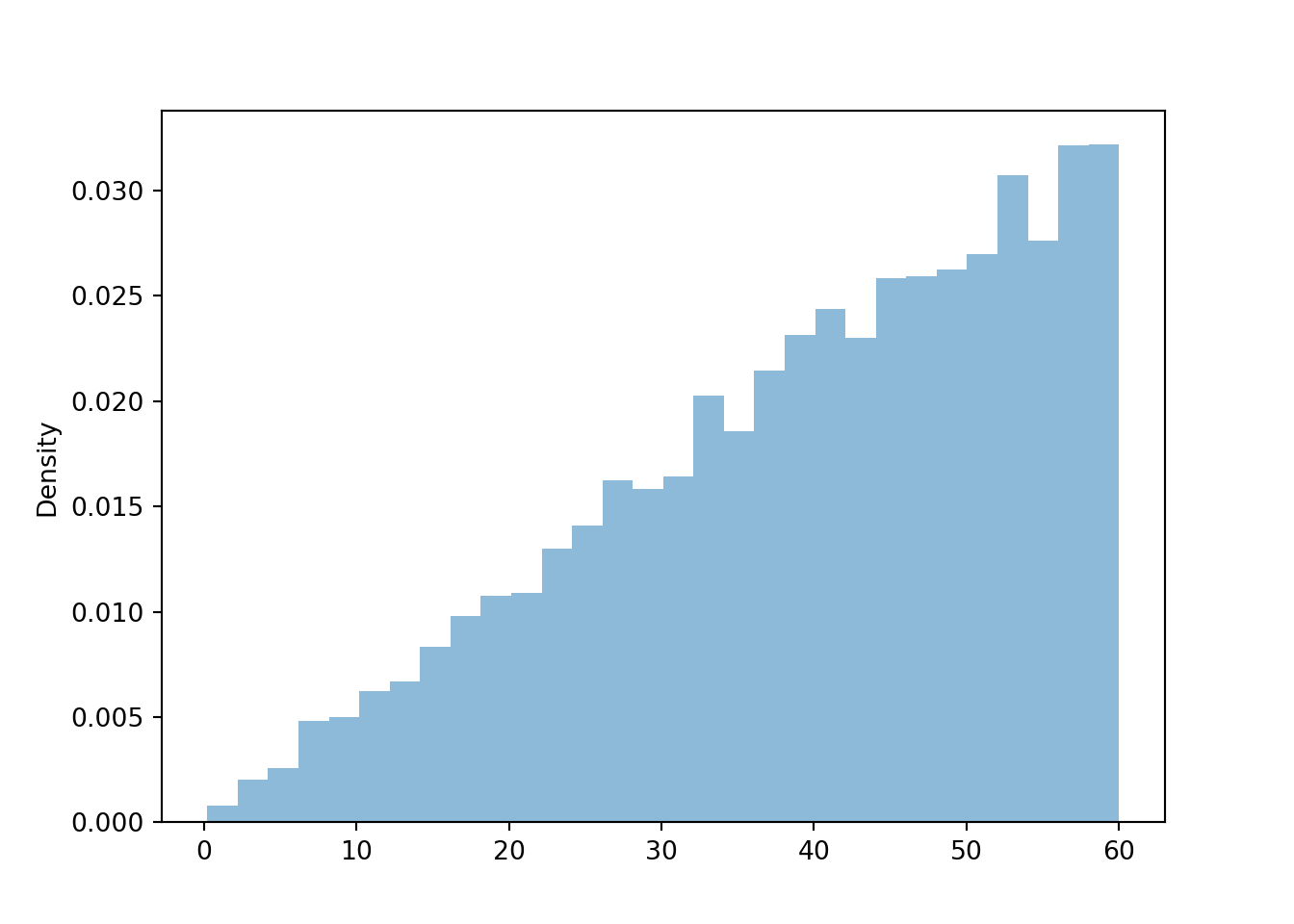
U = RV(Uniform(0, 1))X =60* sqrt(U)x = X.sim(10000)x.plot()
We can approximate \(\textrm{E}(X)\) in the usual way by averaging the simulated values.
x.mean()
40.34829126751766
The code below approximate \(\textrm{E}(X)\) as if \(X\) were a discrete random variable with pmf \(p(x) = (2/3600)x, x = 0, 1, 2, \ldots, 59\).
sum([x * (1* ((2/3600) * x)) for x in np.arange(0, 60, 1)])
np.float64(39.00555555555557)
Now we revise to truncate to the nearest second, treating \(X\) as if were a discrete random variable with pmf \(p(x) = (1/60)((2/3600)x), x = 0, \frac{1}{60}, \frac{2}{60}, \frac{3}{60}, \ldots, 59\frac{57}{60}, 59\frac{58}{60}, 59\frac{59}{60}\).
sum([x * ((1/60) * ((2/3600) * x)) for x in np.arange(0, 60, 1/60)])
np.float64(39.983334876543154)
In general, we need calculus to compute expected values for continuous random variables. However, we can approximate \(\textrm{E}(X)\) for a continuous random variable \(X\) by treating \(X\) as a discrete random variable. Create a “grid” of “close to” values for \(X\) (e.g., rounding to the nearest minute, rounding to 2 decimal places, etc), use the pdf of \(X\) to approximate the probability that \(X\) is close to each of the values in the grid, then multiply the values in the grid by their approximate probability and sum.
Regardless of the type of the random variable (discrete or continuous), its expected value can be interpreted as the long-run average value. Furthermore, \(\textrm{E}(X)\) can be approximated via simulation in the same way for discrete and continuous random variables: simulate many values of \(X\) and average. The average is a “usual” average; just sum all the simulated values and divide by the number of simulated values.
Example 5.13 Continuing Example 5.12. Han’s arrival time \(X\) (minutes after noon) has pdf \[
f_X(x) =
\begin{cases}
(2/3600)x, & 0<x<60,\\
0 & \text{otherwise.}
\end{cases}
\]
Explain how you could use simulation to approximate \(\text{E}(X^2)\).
Explain how you could approximate \(\text{E}(X^2)\) as a sum (like a discrete random variable).
How could you obtain a better approximation than the sum in the previous part?
It can be shown that \(\textrm{E}(X^2) = 1800\) squared-minutes. Compare to the approximations.
Compute \(\text{Var}(X)\).
Compute \(\text{SD}(X)\).
Solution (click to expand)
Solution 5.13.
As usual, we can simulate many values of \(X\), square simulated value to get \(X^2\), and average the squared values. See Symbulate code below. Simulation results suggest \(\textrm{E}(X^2)\) is about 1800 squared-minutes.
Any value in [0, 60] is possible, but we can obtain an approximation by truncating (or rounding) to the nearest minute. We’ll truncate to be consistent with Example 5.11. The probability that \(X\) truncated to the nearest minute is \(x\) is approximately \((1)f(x) = (2/3600)x\); see Example 5.11 for examples. Therefore, we can treat \(X\) like it’s a discrete random variable which takes value \(x = 0, 1, 2, 3, \ldots, 57, 58, 59\) with probability \((2/3600)x\). Then we can compute \(\textrm{E}(X^2)\) for this discrete random variable in the usual way by squaring each of the possible values before multiplying by its probability. \[
{\scriptsize
(0^2)((2/3600)0) + (1^2)((2/3600)1) + (2^2)((2/3600)2) + (3^2)((2/3600)3) + \cdots + (57^2)((2/3600)57) + (58^2)((2/3600)58)+ (59^2)((2/3600)59)
}
\] There are 60 terms in the sum, so use software (see below) or a spreadsheet to compute, arriving at an approximation of 1740.5 squared-minutes.
\(X\) is a continuous random variable but in the previous part we treated it as if were discrete, thus losing some information. The “more continuous” our discrete approximation is, the better it is should be. Thus, we can get a better approximation by truncating (or rounding) to the nearest second.
The probability that \(X\) truncated to the nearest second—that is, 1/60 minute—is \(x\) is approximately \((1/60)f(x) = (1/60)(2/3600)x\). Therefore, we can treat \(X\) like it’s a discrete random variable which takes values, in minutes, \(x = 0, \frac{1}{60}, \frac{2}{60}, \frac{3}{60}, \ldots, 59\frac{57}{60}, 59\frac{58}{60}, 59\frac{59}{60}\) with probability \((1/60)(2/3600)x\); see Example 5.11 for examples. Then we can compute \(\textrm{E}(X^2)\) for this discrete random variable in the usual way by squaring each of the possible values before multiplying by its probability. \[
{\scriptsize
(0)^2((1/60)(2/3600)0) + (1/60)^2((1/60)((2/3600)(1/60))) + (2/60)^2((1/60)((2/3600)(2/60))) + (3/60)^2((1/60)((2/3600)(3/60))) + \cdots
}
\] Now there are 3600 terms in the sum, one for each second between 0 and 60 minutes, so we use software (see below) or a spreadsheet to compute, arriving at an approximation of 1799 minutes.
The simulation yields an approximate expected value close to 1800 squared-minutes. The nearest-minute discretion approximate yields a reasonably close value (1740), and the nearest-second discrete approximation is even closer (1799).
\(\textrm{SD}(X) = \sqrt{\textrm{Var}(X)} = \sqrt{200} = 14.1\) minutes. Roughly, Han’s arrival times vary by about 14 minutes on average from day to day.
We continue the simulation from before.
U = RV(Uniform(0, 1))X =60* sqrt(U)x = X.sim(10000)
We can approximate \(\textrm{E}(X^2)\) by averaging the squares of the simulated \(X\) values.
(x**2).mean()
1818.689541069042
Then the approximate variance is
(x**2).mean() - x.mean()**2
196.45260800775236
x.var()
196.452608007753
x.sd()
14.0161552505583
The code below approximates \(\textrm{E}(X^2)\) as if \(X\) were a discrete random variable with pmf \(p(x) = (2/3600)x, x = 0, 1, 2, \ldots, 59\). Notice that the probabilities have not changed; we are just multiplying them by the \(x^2\) values instead of the \(x^2\) values.
sum([(x**2) * (1* ((2/3600) * x)) for x in np.arange(0, 60, 1)])
np.float64(1740.5000000000002)
Now we revise to truncate to the nearest second, treating \(X\) as if were a discrete random variable with pmf \(p(x) = (1/60)((2/3600)x), x = 0, \frac{1}{60}, \frac{2}{60}, \frac{3}{60}, \ldots, 59\frac{57}{60}, 59\frac{58}{60}, 59\frac{59}{60}\). Again, notice that the probabilities have not changed; we are just multiplying them by the \(x^2\) values instead of the \(x^2\) values.
sum([(x**2) * ((1/60) * ((2/3600) * x)) for x in np.arange(0, 60, 1/60)])
np.float64(1799.0001388888872)
Variance is defined in the same for all random variables regardless of type: \(\textrm{Var}(X) = \textrm{E}((X-\textrm{E}(X))^2)\), which is equivalently \(\textrm{Var}(X) = \textrm{E}(X^2)-\textrm{E}(X)^2\). Simulation can be used to approximate variance in the same way for discrete and continuous random variables.
5.9 Exponential Distributions
Exponential distributions are often used to model the waiting times between events in a random process that occurs continuously over time. Example 5.6 is one example of an Exponential distribution. Let’s take a closer look at this example.
Let \(X\) be the random variable measuring the time, in minutes, between earthquakes in Example 5.6. We assume that \(X\) has an “Exponential distribution with rate parameter 1/120”; our goal is to see what this means. Table 5.1 contains only certain percentiles of this distribution; these percentiles are displayed in Figure 5.20 (a). Figure 5.20 (b) fills in the gaps and displays the corresponding cdf14. For example, 240 minutes is a little over the 85th percentile (it’s about the 86.5th percentile) and the 65th percentile is a little over 120 minutes (it’s about 126.0 minutes).
Figure 5.20: Percentiles for Example 5.6 corresponding to an Exponential distribution with rate parameter 1/120.
We can use Symbulate to evaluate the Exponential(rate = 1 / 120) cdf and the corresponding quantile function. The results are consistent with Table 5.1 and Figure 5.20.
We can use the cdf in Figure 5.20 (b) to fill in the gaps in the spinner in Figure 5.9 to create an “Exponential(rate = 1/120) spinner”. Then we can use the spinner to simulate many values of \(X\). Below we use Symbulate to define an RVX with the Exponential(rate = 1 / 120) distribution and simulate many values of it. The simulation results seem consistent with what we have seen so far.
X = RV(Exponential(rate =1/120))x = X.sim(10000)x
Index
Result
0
35.40843516668838
1
108.0711307701917
2
68.11305728393533
3
83.59503469186816
4
353.48153418534747
5
57.076219807080285
6
85.30454116404081
7
209.14165800662386
8
17.40923994879462
...
...
9999
26.391514527845022
x.count_lt(240) / x.count()
0.8677
x.quantile(0.65)
123.93585141530265
The histogram below summarizes the simulated values of \(X\). The orange curve represents the theoretical pdf for the Exponential distribution with rate 1/120. Compare to Figure 5.10
plt.figure()x.plot()Exponential(rate =1/120).plot();# overlay theoretical pdf
<symbulate.distributions.Exponential object at 0x000002647C33AF90>
plt.show();
We hope the above convinces you that Example 5.6 involves an Exponential distribution with rate parameter 1/120. Now let’s investigate some more properties.
Example 5.14 Continuing Example 5.6, let \(X\) be the random variable measuring the time, in minutes, between earthquakes and assume that \(X\) has an Exponential distribution with rate parameter 1/120.
Without doing a simulation, approximate the probability that \(X\) rounded to the nearest second is 30 minutes.
Without doing a simulation, approximate how much more likely that \(X\) rounded to the nearest second is to be 30 than 60 minutes.
Explain how you could approximate \(\textrm{E}(X)\) as a sum (like a discrete random variable) without doing a simulation, then do it.
Explain how you could use simulation to approximate \(\textrm{E}(X)\), then do it.
It can be shown that \(\textrm{E}(X) =120\) minutes. Interpret this value in context.
Interpret the rate parameter 1/120 in context.
Solution (click to expand)
Solution 5.14.
A one second, that is a 1/60 minute interval, is small in the scale of our variable whose values range over hundreds of minutes. So we can approximate the probability of interest—represented by the area under the pdf over a one second interval centered on \(x=30\)—by a rectangle with base (1/60) minutes and height equal to the Exponential(rate = 1/120) pdf evaluated at 30. We can use Symbulate to evaluate the Exponential pdf. Thus the approximate probability is (1 / 60) * Exponential(rate = 1 / 120).pdf(30) which yields 0.00011. This is a small probability because “within 1 second of 30 minutes” is a very specific event.
Compute the ratio of pdf heights at 30 and 60: Exponential(rate = 1 / 120).pdf(30) / Exponential(rate = 1 / 120).pdf(60) which yields 1.28. \(X\) rounded to the nearest second is 1.28 times more likely to be 30 minutes than 60 minutes.
We could round \(X\) to the nearest second, compute the probability that \(X\) is close to each rounded value x, then multiply each rounded value by its “close to” probability ((1 / 60) * Exponential(rate = 1 / 120).pdf(x)) and sum. Each term in the sum would be of the form x * (1 / 60) * Exponential(rate = 1 / 120).pdf(x); the first x represents the value, the rest represents its (close to) probability. For example, one term in the sum would be 30 multiplied by (1 / 60) * Exponential(rate = 1 / 120).pdf(30) (0.00011 from two parts ago). Technically, there is no upper bound on \(X\), but we would need to cut the sum off at some point. In particular, 1200 minutes is the 99.995th percentile (Exponential(rate = 1/120).cdf(1200) is 0.99995) so we’ll cut the sum off after 1200 minutes. That is, we sum x * (1 / 60) * Exponential(rate = 1 / 120).pdf(x) for x ranging from 0 to 1200 minutes in increments of 1/60 minutes. See Symbulate code below, which results in a value close to 120 minutes.
Approximate \(\textrm{E}(X)\) in the usual way: simulate many values of \(X\) and average the simulated values. We already simulated many values above, so we just need to call x.mean(). The simulated average is around 120 minutes.
Over many earthquakes, the time between earthquakes is 120 minutes on average.
The previous part shows that, roughly, earthquakes occur every 120 minutes on average. In other words, on average there is 1 earthquake per every 120 minutes. Roughly, earthquakes occur at rate 1 earthquake per 120 minutes on average.
The following Symbulate code uses the Exponential(rate = 1/120) pdf to compute “close to” probabilities.
The following Symbulate code approximates the expected value of \(X\) as if \(X\) were a discrete random variable after rounding to the nearest second.
sum([x * (1/60) * Exponential(rate =1/120).pdf(x) for x in np.arange(0, 1200, 1/60)])
np.float64(119.9400681164045)
Exponential distributions are often used to model the waiting time in a random process until some event occurs. If \(X\) has an Exponential distribution its measurement units are usually units of time (e.g., seconds, minutes, hours, days, weeks, etc). An Exponential distribution has a single parameter denoted \(\lambda>0\) which represents the rate, per unit time, at which events occur. If \(X\) has an Exponential distribution with rate parameter \(\lambda\) then \(\textrm{E}(X) = 1/\lambda\). Don’t confuse the rate and the mean.
\(\lambda\) is the average rate at which events occur over time (e.g., if \(X\) is measured in hours and \(\lambda = 2\) then the rate is 2 per hour)
\(1/\lambda\) is the mean time between events (e.g., 1/2 hour)
Warning
The parameter \(\lambda\) in our definition of Exponential distributions is the rate parameter, so that the mean is \(1/\lambda\). Other references might parameterize Exponential distributions in terms of their mean. When dealing with problems involving Exponential distributions pay close attention to whether the rate (\(\lambda\)) or the mean (\(1/\lambda\)) is specified.
We have looked at an example of an Exponential distribution, but we haven’t really defined what an Exponential distribution is yet. The next example sheds some light on where the definition comes from.
We have seen that the mean is 120 minutes. Express each of the percentiles in Table 5.1 as a multiple of the mean.
Now suppose that \(M\) has an Exponential(1) distribution. What is \(\textrm{E}(M)\)? Use Symbulate to compute the 10th, 20th, through 90th percentiles of \(M\). Compare to part 1.
Solution (click to expand)
Solution 5.15.
Just divide each Value (minutes) in Table 5.1 by 120 minutes. For example, the 10th percentile is \(12.6/120= 0.105\) times the mean, and the 90th percentile is \(276.3/120= 2.303\) times the mean. See Table 5.3.
If \(M\) has an Exponential(1) distribution then \(\textrm{E}(M) = 1\). See Symbulate code below. We see that evaluating the Exponential(1) quantile function tells us the percentile for an Exponential distribution in terms of multiples of the mean.
Table 5.3: Percentiles for the Exponential distribution with rate 1/120 as multiples of the mean (120)
Percentile
Value (minutes)
Multiple of mean
10th
12.6
0.105
20th
26.8
0.223
30th
42.8
0.357
40th
61.3
0.511
50th
83.2
0.693
60th
110.0
0.917
70th
144.5
1.204
80th
193.1
1.609
90th
276.3
2.303
The Symbulate code below evaluates select percentiles for the Exponential(1) distribution. Since the mean of this distribution is 1, these percentiles are expressed directly in terms of multiples of the mean.
Any Exponential distribution has the same basic shape. Percentiles of an Exponential distribution follow a particular pattern in terms of mutliples of the mean.
Definition 5.4 (Exponential percentile pattern) A continuous random variable \(X\) has an Exponential distribution if its cdf is given by Figure 5.21. If \(X\) has an Exponential distribution with rate parameter \(\lambda>0\), its mean is \(\textrm{E}(X)= 1/\lambda\) and Figure 5.21 specifies the cdf of \(X\) in terms of multiples of the mean. Table 5.4 displays select percentiles for Exponential distributions (in terms of multiples of the mean).
(a) Percentiles highlighted in 0.5 increments of multiples of the mean
(b) Deciles highligted in terms of multiples of the mean
Figure 5.21: The Exponential(1) cdf. Provides the cdf for any Exponential distribution if the variable is measured in multiples of the mean. It’s the same cdf in both figures just with different values highlighted.
Table 5.4: Select percentiles for an Exponential distribution in terms of multiples of the mean
(a) In 0.5 increments of multiples of the mean
Percentile
Relative to mean
0%
0.0 times the mean
39.3%
0.5 times the mean
63.2%
1.0 times the mean
77.7%
1.5 times the mean
86.5%
2.0 times the mean
91.8%
2.5 times the mean
95%
3.0 times the mean
97%
3.5 times the mean
98.2%
4.0 times the mean
98.9%
4.5 times the mean
99.3%
5.0 times the mean
(b) Deciles and quantiles as multiples of the mean
Percentile
Relative to mean
10%
0.11 times the mean
20%
0.22 times the mean
25%
0.29 times the mean
30%
0.36 times the mean
40%
0.51 times the mean
50%
0.69 times the mean
60%
0.92 times the mean
70%
1.20 times the mean
75%
1.39 times the mean
80%
1.61 times the mean
90%
2.30 times the mean
5.10 Normal distributions
Normal distributions are probably the most important distributions in probability and statistics. We have already seen Normal distributions in many previous examples. In this section we’ll explore properties of Normal distributions in a little more depth.
A Normal(\(\mu\), \(\sigma\)) distribution has two parameters: its mean, typically denoted \(\mu\), and its standard deviation, typically denoted \(\sigma>0\). Any Normal distribution follows the “empirical rule” which determines the percentiles that give a Normal distribution its particular bell shape. We introduced this empirical rule briefly in Section 3.8.2. For example, for any Normal distribution about 68% of values lie within 1 standard deviation of the mean. This implies that 32% of values are more than 1 standard deviation away from the mean, either above or below the mean. By symmetry 16% of values are more than 1 standard deviation above the mean. In other words, 1 standard deviation above the mean is the 84th percentile: 16% of values are greater so 84% of values are less. Similarly 1 standard devation below the mean is the 16th percentile.
The key to working with Normal distributions is to work in terms of standard deviations from the mean (that is, standardized values). The following definition fills in the rest of the empirical rule.
Definition 5.5 (Normal empirical rule) A continuous random variable \(Z\) has a standard Normal distribution, a.k.a., a Normal(0, 1) distribution, if its cdf is given by Figure 5.22. If \(X\) has a Normal(\(\mu\), \(\sigma\)) distribution with mean \(\mu\) and standard deviation \(\sigma>0\), Figure 5.22 specifies the cdf of \(X\) in terms of standard deviations from the mean \(Z=\frac{X-\mu}{\sigma}\). Table 5.5 displays select percentiles for Normal distributions (in terms of standard deviations from the mean).
(a) Percentiles highlighted in 0.5 increments of standard deviations from the mean
(b) Deciles highligted in terms of standard deviations from the mean
Figure 5.22: The Normal(0, 1) cdf. Provides the cdf for any Normal distribution if the variable is measured in standard deviations from the mean. It’s the same cdf in both figures just with different values highlighted.
Table 5.5: Select percentiles for a Normal distribution in terms of standard deviations from the mean
(a) In 0.5 increments of standard deviations from the mean
Percentile
Standard deviations from the mean
0.02%
-3.5
0.1%
-3.0
0.6%
-2.5
2.3%
-2.0
6.7%
-1.5
15.9%
-1.0
30.9%
-0.5
50%
0.0
69.1%
0.5
84.1%
1.0
93.3%
1.5
97.7%
2.0
99.4%
2.5
99.9%
3.0
99.98%
3.5
(b) Deciles and quantiles as standard deviations from the mean
Percentile
Standard deviations from the mean
1%
-2.33
5%
-1.64
10%
-1.28
20%
-0.84
25%
-0.67
30%
-0.52
40%
-0.25
50%
0.00
60%
0.25
70%
0.52
75%
0.67
80%
0.84
90%
1.28
95%
1.64
99%
2.33
Figure 5.22 defines a Normal distribution by specifying all of its percentiles. The empirical rule is often described in terms of “within [blank] standard deviations of the mean” as in the the following:
38% of values are within 0.5 standard deviations of the mean
68% of values are within 1 standard deviation of the mean
87% of values are within 1.5 standard deviations of the mean
95% of values are within 2 standard deviations of the mean
99% of values are within 2.6 standard deviations of the mean
99.7% of values are within 3 standard deviations of the mean
99.99% of values are within 4 standard deviations of the mean
The standard Normal cdf can be used to construct a spinner, like Figure 5.23 which fills in the gaps in Figure 3.31, for simulating values from any Normal distribution. The spinner simulates values in terms of standard deviations from the mean, which can then be converted to measurement units of the variable.
(a) Each sector represents an interval with 5% probability
(b) Each sector represents an interval with 1% probability
(c) Values labeled in increments of 0.5 standard deviations from the mean
Figure 5.23: A continuous Normal(0, 1) spinner. The same spinner is displayed in all figures, with different features highlighted. Only selected rounded values are displayed, but in the idealized model the spinner is infinitely precise so that any real number is a possible outcome. Notice that the values on the axis are not evenly spaced. This spinner can be used to simulate values from any Normal distribution by simulating values in terms of standard deviations from the mean.
Consider the meeting problem where the arrival time, measured in minutes after noon, followed a Normal(30, 10) distribution. Then, for example,
1 standard deviation above the mean corresponds to \(30 + 1 \times 10 = 40\) minutes,
2 standard deviations above the mean corresponds to \(30 + 2 \times 10 = 50\) minutes,
2.5 standard deviations above the mean corresponds to \(30 + 2.5 \times 10 = 55\) minutes,
1 standard deviation below the mean corresponds to \(30 + (-1) \times 10 = 20\) minutes
2 standard deviations below the mean corresponds to \(30 + (-2) \times 10 = 10\) minutes
2.5 standard deviations below the mean corresponds to \(30 + (-2.5) \times 10 = 5\) minutes
and so on. In general, \(Z\) standard deviations from the mean corresponds to \(X = 30 + 10Z\) minutes. Thus we can either simulate \(X\) values from a Normal(30, 10) distribution directly, or simulate values of \(Z\) from a Normal(0, 1) distribution and let \(X = 30 + 10Z\).
Z = RV(Normal(0, 1))X_from_Z =30+10* ZX = RV(Normal(30, 10))plt.figure()X_from_Z.sim(10000).plot()X.sim(10000).plot()Normal(30, 10).plot();plt.show()
Example 5.16 The wrapper of a package of candy lists a weight of 47.9 grams. Naturally, the weights of individual packages vary somewhat. Suppose package weights have an approximate Normal distribution with a mean of 49.8 grams and a standard deviation of 1.3 grams.
Sketch the distribution of package weights. Carefully label the variable axis. It is helpful to draw two axes: one in the measurement units of the variable, and one in standardized units.
Why wouldn’t the company print the mean weight of 49.8 grams as the weight on the package?
Estimate the probability that a package weighs less than the printed weight of 47.9 grams.
Estimate the probability that a package weighs between 47.9 and 53.0 grams.
Suppose that the company only wants 1% of packages to be underweight. Find the weight that must be printed on the packages.
Find the 99th percentile of package weights. How can you use the work you did in the previous part?
Solution (click to expand)
Solution 5.16.
See Figure 5.24. Be sure to label the variable axis so that the inflection points are 1 SD away from the mean.
If the company prints the mean weight of 49.8 grams on the package then 50% of the packages would weigh less than the printed weight, which is probably a much higher percentage than desired.
The standardized value for a weight of 47.9 grams is \((47.9 - 49.8) /1.3=-1.46\). That is, a package weight of 47.9 grams is 1.46 SDs below the mean. From the empirical rule, the 6.5th percentile is 1.5 SDs below the mean. Therefore, we estimate that the probability is a little larger than 6.5%. Software (below) shows that the probability is 0.072.
The standardized value for a weight of 53.0 grams is \((53.0 - 49.8) /1.3=2.46\). That is, a package weight of 53.0 grams is 2.46 SDs above the mean. From the empirical rule, the 99.4rd percentile is 2.5 SDs above the mean. So about \(99.4 - 6.5 = 92.5\) percent of packages weight between 47.9 and 53.0 grams. Software shows that the probability is 0.921.
From the empirical rule, the first percentile is 2.33 SDs below the mean. Therefore, the 1st percentile of package weights is \(49.8 - 2.33\times 1.3 = 46.8\) grams.
By symmetry, if the 1st percentile is 2.33 SDs below the mean, then the 99th percentile is 2.33 SDs above the mean. Therefore, the 99th percentile of package weights is \(49.8 + 2.33\times 1.3 = 52.9\) grams.
Figure 5.24: The Normal(49.8, 1.3) distribution of package weights (grams) in Example 5.16.
In Symbulate, we can standardize first and use the Normal(0, 1) cdf.
Or we can work in the measurement units of the variable using the appropriate mean and standard deviation.
Normal(49.8, 1.3).cdf(47.9)
np.float64(0.07193386424080776)
Normal(49.8, 1.3).cdf(53.0)
np.float64(0.9930828718071456)
Normal(49.8, 1.3).quantile(0.01)
np.float64(46.77574776374691)
Normal(49.8, 1.3).quantile(0.99)
np.float64(52.82425223625309)
5.10.1 Exercises
Exercise 5.1 For many animal species, the lengths of particular bones follow a Normal distribution. For adult male humans, the length of the femur (thigh bone, the longest bone in humans) has an approximate Normal distribution with mean 48.2 cm and standard deviation of 4.5 cm.
Complete each of the following parts by standardizing, drawing appropriate plots, and then providing an educated ballpark estimate based on the empirical rule. Then you can use software to get more precise values. But software should be your last step, not the first.
What percent of adult male humans have a femur length above 50cm?
What percent of adult male humans have a femur length between 40cm and 50cm?
What is the 99th percentile of femur lengths for adult male humans?
Exercise 5.2 Daily high temperatures (degrees Fahrenheit) in San Luis Obispo in August follow (approximately) A Normal distribution with a mean of 76.9 degrees F. The temperature exceeds 100 degrees Fahrenheit on about 1.5% of August days.
Compute the standard deviation.
Suppose the mean increases by 2 degrees Fahrenheit. On what percentage of August days will the daily high temperature exceed 100 degrees Fahrenheit? (Assume the standard deviation does not change.)
A mean of 78.9 is 1.02 times greater than a mean of 76.9. By what (multiplicative) factor has the percentage of 100-degree days increased? What do you notice?
Exercise 5.3 In a large class, scores on midterm 1 follow (approximately) a Normal\((\mu_1, \sigma)\) distribution and scores on midterm 2 follow (approximately) a Normal\((\mu_2, \sigma)\) distribution. Note that the SD \(\sigma\) is the same on both exams. The 40th percentile of midterm 1 scores is equal to the 70th percentile of midterm 2 scores. Compute and interpret \[
\frac{\mu_1-\mu_2}{\sigma}
\] This is one statistical measure of effect size. Hint: do not try to solve for \(\mu_1, \mu_2,\sigma\) individually.
There is another type of weird random variable which has a “singular” distribution, like the Cantor distribution, but we’re counting these random variables as not commonly encountered.↩︎
Why is the interval \([0, 1]\) the standard instead of some other range of values? Because probabilities take values in \([0, 1]\). We will see why this is useful in more detail later.↩︎
In practice we would rarely care about this many decimal places. We call your attention to the decimals merely to illustrate the continuous nature of the values.↩︎
Symbulate chooses the number of bins automatically, but you can set the number of bins using the bins option, e.g., .plot(bins = 10)↩︎
Symbulate will always produce a histogram with equal bin widths.↩︎
Histograms with bars of equal area are sometimes called “percentograms”.↩︎
We can use algebra or symbolic mathematics software. Technically, \(x = -60\sqrt{p}\) is a second solution of the equation \((x/60)^2 = p\), but we also need \(x\) to be a possible value of the random variable.↩︎
The inverse of a cdf might not exist, if the cdf has jumps or flat spots. In particular, the inverse cdf does not exist for discrete random variables for which the cdf is a step function. In general, the quantile function corresponding to cdf \(F\) is defined as \(Q(p) = \inf\{u:F(u)\ge p\}\), but this is a technicality we don’t really need to worry about. Cumulative distribution functions and quantile functions are most useful for continuous random variables, in which case the inverse cdf exists and is the quantile function.↩︎
Approximating a cdf with an ecdf involves approximating infinitely many probabilities since \(F(x)\) is a different probability for each \(x\). As discussed in Section 3.6.2 the simulation margin of error needs to be adjusted when approximating multiple probabilities. Fortunately there is an efficient way to simultaneously approximate all probabilities comprising the cdf (based on the Dvoretzky–Kiefer–Wolfowitz inequality). Roughly, the margin of error (for 95% confidence) for an ecdf is \(1.36/\sqrt{N}\), where \(N\) is the number of independently simulated values used to construct the ecdf (rather than the usual \(1/\sqrt{N}\) for estimating a single probability).↩︎
Mathematically, universality of the uniform can be stated as follows. Let \(F\) be a cdf and \(Q=F^{-1}\) its corresponding quantile function. Let \(U\) have a Uniform(0, 1) distribution and define the random variable \(X=Q(U)\). Then the cdf of \(X\) is \(F\).↩︎
We could round to the nearest minute in which case some of the approximations would become exact, e.g., \(\textrm{P}(14.5<X<15.5) = f(15)(1)\) for this example. But in general the pdf will only provide approximations like the ones we get when we truncate in this example. In practice, we would approximate the same way regardless of whether we’re considering “within one minute after 12:15” or “within one minute of 12:15”.↩︎
In this case, the approximation is better if we use the midpoint of each of the truncated intervals instead of the left endpoint, so that the possible values are \(0.5, 1.5, 2.5, \ldots 59.5\). Also, rounding instead of truncating yields the actual value of 40 minutes.↩︎
We will see the mathematical formula in a later chapter. For now just notice how the smooth curve representing the cdf is consistent with the percentiles in Example 5.6.↩︎